Styles
Quick style lookup
| Looking for a style for… | Class |
|---|---|
| Navigation bar | NavigationBarStyle |
| Text input field | ChatInputTextStyle |
| Input panel (buttons + field) | ChatInputStyle |
| Voice recording | ChatInputVoiceStyle |
| Audio player | AudioPlayerStyle |
| Search bar | SearchBarStyle |
| Loading screen | ChatLoadingStyle |
| Loading indicator | LoadingIndicatorStyle |
| Empty chat | ChatPlaceholderStyle |
| Loading error | ChatPlaceholderErrorStyle |
| Text message | TextChatMessageStyle |
| File message | FileChatMessageStyle |
| Image message | ImageChatMessageStyle |
| Voice message | AudioChatMessageStyle |
| Survey / rating | SurveyChatMessageStyle |
| Quote | QuoteStyle |
| Quick replies (bot) | QuickReplyStyle |
| Search result | SearchChatMessageStyle |
| Attachment menu | ChatMenuStyle |
| Toast notification | ToastAlertStyle |
| Scroll-to-new button | ScrollToMessageButtonStyle |
Each element's appearance is controlled through the matching style class. Visual references are available on the Components and User Flow pages in Figma.
| Style class | Description | Design |
|---|---|---|
| Base interface elements | ||
NavigationBarStyle | Navigation bar style in the chat | 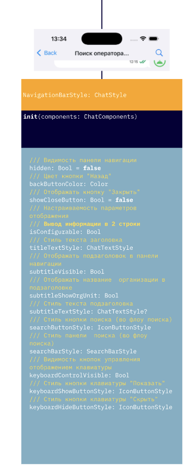 |
ChatLoadingStyle | Overall chat loading screen style | 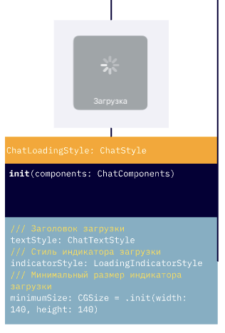 |
ChatPlaceholderStyle | Empty chat state style (e.g., no messages) | 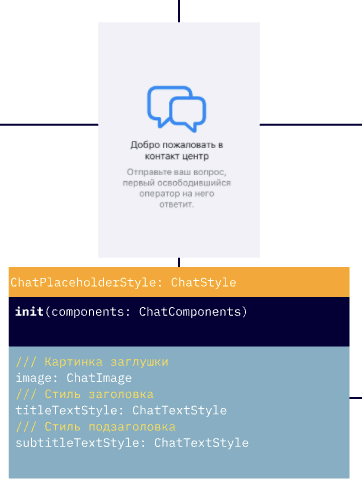 |
ChatPlaceholderErrorStyle | Error display style (e.g., failed to load chat) | 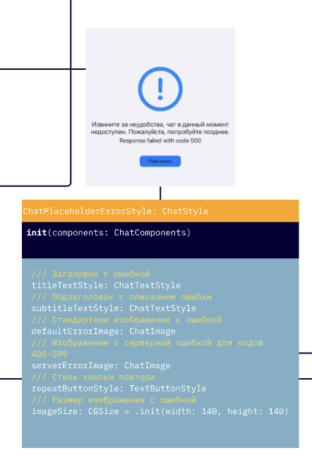 |
LoadingIndicatorStyle | Loading indicator style (in messages, actions) | 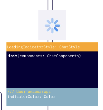 |
ChatInputStyle | Message input panel style in the chat | 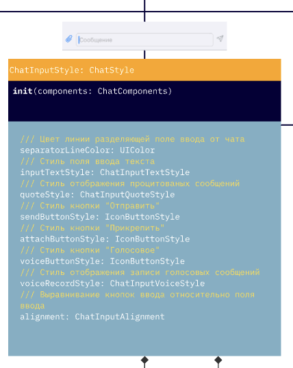 |
ChatInputTextStyle | Text input container style | 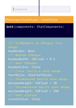 |
ChatInputVoiceStyle | Voice recording element style | 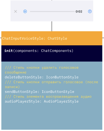 |
ChatInputQuoteStyle | Quote panel above the input field. See the warning below | 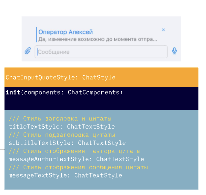 |
SearchBarStyle | Search bar style in the navigation bar | 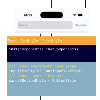 |
ToastAlertStyle | Toast notification style | 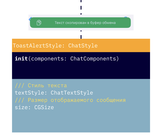 |
ScrollToMessageButtonStyle | Scroll-to-new-messages button. alwaysShow (always visible) applies only to the "down" button in ChatFlow.scrollToBottomUnreadMessagesButtonStyle; for the up button this flag is ignored. badgeStyle: ChatTextStyle defines the font and color of the unread count on the badge. | |
ChatMenuStyle | Attachment menu style | 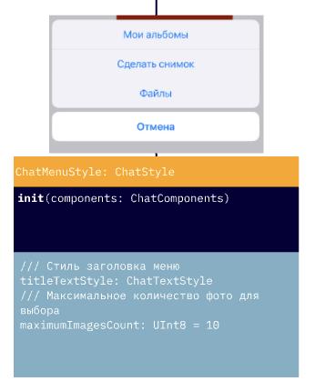 |
ProgressViewStyle | Progress indicator style (file uploads, etc.) | |
ButtonStyle | Base chat button style | |
TextButtonStyle | Text-only button (no background) | |
IconButtonStyle | Icon button | |
NavigationBarButtonStyle | Navigation bar button with positioning support | |
AudioPlayerStyle | Audio player style (in chat or standalone) | 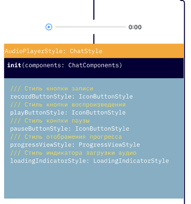 |
The titleTextStyle and subtitleTextStyle properties of ChatInputQuoteStyle are not applied in the current version — the quote panel above the input field uses only messageAuthorTextStyle (quote header) and messageTextStyle (quoted message text). See Known limitations.
Search screen styles
| Name | Description | Design |
|---|---|---|
SearchFlow | Search screen style: searchMessageStyle (SearchChatMessageStyle), notFoundImage, notFoundTextStyle | 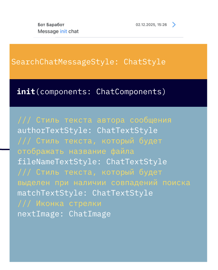 |
Message styles
| Name | Description | Design |
|---|---|---|
ChatMessagesStyles | Container of message styles for one direction (incoming or outgoing) | |
ChatMessageStyle | Base message style in the chat | |
TextChatMessageStyle | Text message style | 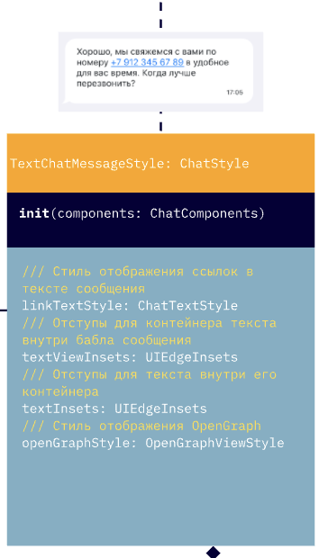 |
FileChatMessageStyle | File message style | 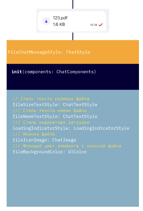 |
SearchChatMessageStyle | Search highlight style in messages | |
ImageChatMessageStyle | Image-in-message style | 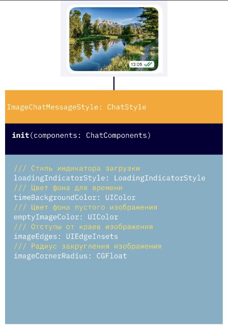 |
AudioChatMessageStyle | Audio message style | 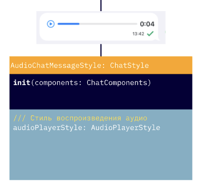 |
SurveyChatMessageStyle | In-message survey/vote style. questionButtonColor: ChatButtonColor (with three states: normal, highlighted, disabled) replaces the deprecated questionBackgroundColor: UIColor — migration is not 1:1 | 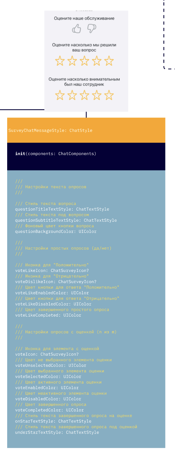 |
ScheduleChatMessageStyle | Schedule / reminder message style | 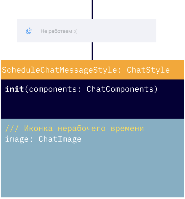 |
OperatorJoinedChatMessageStyle | Operator-joined-chat message style | 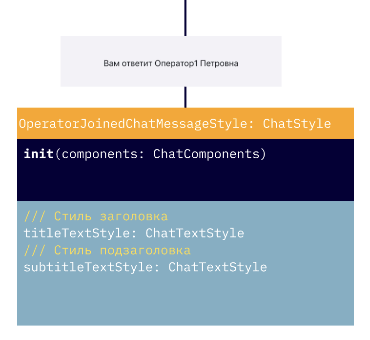 |
QuickReplyStyle | Quick replies style | 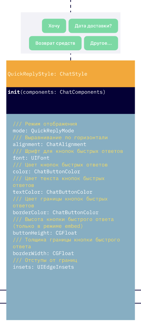 |
QuoteStyle | Message quote display style | 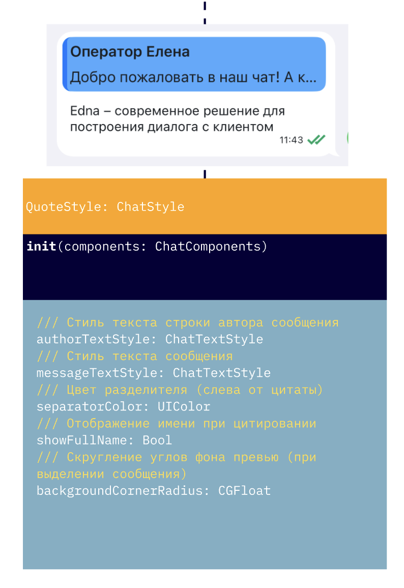 |
OpenGraphViewStyle | OpenGraph display style in text messages | 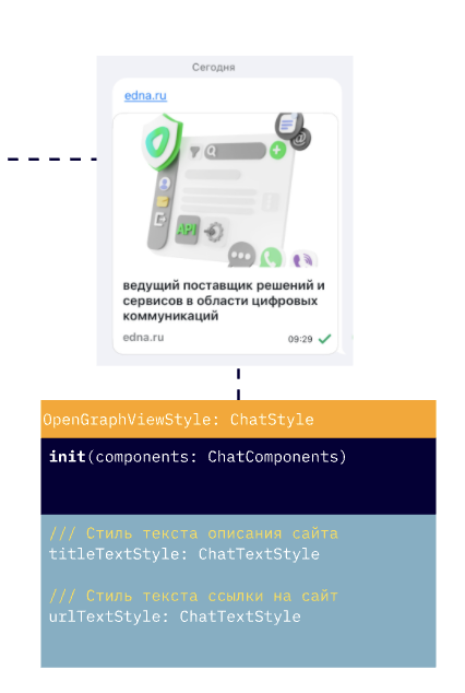 |
System message styles
System messages (centered in the chat) live in the ChatSystemMessagesStyles container, accessible via chatFlow.systemMessages.
| Property | Type |
|---|---|
operatorJoinedMessageStyle | OperatorJoinedChatMessageStyle |
scheduleMessageStyle | ScheduleChatMessageStyle |
surveyMessageStyle | SurveyChatMessageStyle |
dateMessageStyle | ChatTextStyle |
// Set this before the first chat open: on first access to
// chatFlow.systemMessages, all nested styles are initialized from
// the current tokens and stop tracking further token changes.
theme.flows.chatFlow.systemMessages.surveyMessageStyle.questionButtonColor =
    ChatButtonColor(normal: .systemBlue, highlighted: .systemTeal, disabled: .systemGray)
theme.flows.chatFlow.systemMessages.dateMessageStyle = ChatTextStyle(
    font: .systemFont(ofSize: 12),
    color: .secondaryLabel
)
Navigation bar buttons
NavigationBarButtonStyle inherits from IconButtonStyle and adds a positioning property. Used for buttons in the top navigation bar of chat and search screens.
Constructor:
let backButton = NavigationBarButtonStyle(
    image: ChatImage(system: "chevron.left", tintColor: .white),
    position: .left,
    components: components
)
Main property:
| Property | Type | Description |
|---|---|---|
position | NavigationBarButtonPosition | Button placement (default .right) |
The constructor sets backgroundColor = .clear and tintColor = image.tintColor ?? .systemBlue — so the icon color is taken from the tintColor of the passed ChatImage, and the background is transparent by default. To change the background or color, override these properties on the already-created instance:
backButton.backgroundColor = .black
backButton.tintColor = .yellow
NavigationBarButtonPosition
Enum that controls the button placement in the navigation bar:
| Value | Description |
|---|---|
.left | Placed on the left (typically for a "back" button) |
.right | Placed on the right (default) |
Example:
let searchButton = NavigationBarButtonStyle(
    image: ChatImage(system: "magnifyingglass", tintColor: .systemBlue),
    position: .right,
    components: components
)
Enums and helper types
QuickReplyMode
Quick reply display mode (QuickReplyStyle.mode):
| Value | Description |
|---|---|
.toolbar | Buttons appear above the input panel |
.embed | Buttons appear inside the chat as part of a message (default) |
ChatAlignment
Horizontal alignment (QuickReplyStyle.alignment):
| Value | Description |
|---|---|
.left | Left-aligned |
.center | Centered |
.right | Right-aligned (default) |
ChatInputAlignment
Vertical alignment of buttons in the input panel (ChatInputStyle.alignment):
| Value | Description |
|---|---|
.top | Buttons on top |
.center | Centered |
.bottom | At the bottom (default) |
ChatSurveyIcon
Icon model for surveys (SurveyChatMessageStyle.voteLikeIcon, voteDislikeIcon, voteIcon):
let icon = ChatSurveyIcon(
    unselectedImage: ChatImage(system: "hand.thumbsup"),
    selectedImage: ChatImage(system: "hand.thumbsup.fill")
)
surveyStyle.voteLikeIcon = icon
In-bubble message styles (TextChatMessageStyle, ImageChatMessageStyle, AudioChatMessageStyle, FileChatMessageStyle, SearchChatMessageStyle, SurveyChatMessageStyle, ScheduleChatMessageStyle, OperatorJoinedChatMessageStyle) inherit common properties from ChatMessageStyle:
| Property | Type | Description |
|---|---|---|
textStyle | ChatTextStyle | Message text style |
timeTextStyle | ChatTextStyle | Send-time style |
editedStatusImage | ChatImage | Icon for an edited message |
pendingStatusImage | ChatImage | "Sending" icon |
deliveredStatusImage | ChatImage | "Sent" icon |
readStatusImage | ChatImage | "Read" icon |
errorTextStyle | ChatTextStyle | Text style for a send error |
errorInfoButton | IconButtonStyle | "i" button next to a failed message |
errorStatusColor | UIColor | Status color on error |
errorTimeTextStyle | ChatTextStyle | Time style on error |
messageBubbleEndMargin | CGFloat | Margin from bubble to screen edge |
containerRightOffset | CGFloat | Container offset for outgoing messages |
containerLeftOffset | CGFloat | Container offset for incoming messages |
QuoteStyle, OpenGraphViewStyle and QuickReplyStyle inherit from ChatStyle directly and have their own set of properties.
Unique properties of each message type — in the API Reference.
ChatMessagesStyles properties
Container of message styles for one direction (outcomeMessages / incomeMessages). In addition to nested styles for specific message types (textMessageStyle, imageMessageStyle, audioMessageStyle, fileMessageStyle), it holds shared bubble and avatar properties:
| Property | Type | Description |
|---|---|---|
bubbleMaskImage | ChatImage | Message bubble mask shape |
bubbleTintColor | UIColor | Bubble background color |
bubbleMaskInsets | UIEdgeInsets | Bubble mask insets |
bubbleErrorColor | UIColor | Bubble color on send error |
deletedTextStyle | ChatTextStyle | Text style for a deleted message |
showAvatar | Bool | Whether to show the avatar (default true) |
avatarSize | CGSize | Avatar size (default 40×40) |
avatarOffset | CGFloat | Avatar offset |
avatarPlaceholderImage | ChatImage | Placeholder if the avatar fails to load |
quoteStyle | QuoteStyle | Style of quotes inside the message |
When you replace chatFlow.incomeMessages with a new ChatMessagesStyles instance, the SDK automatically mirrors bubbleMaskImage if you didn't set it explicitly — see Glossary.
Assigning bubbleTintColor re-creates the current bubbleMaskImage with the new color — if you change both the mask and the color, set bubbleMaskImage after bubbleTintColor.
You can build a style with the base constructor:
let outcomeMessages = ChatMessagesStyles(components: components)
outcomeMessages.textMessageStyle.textStyle.color = .black
outcomeMessages.showAvatar = showOutcomeAvatar
outcomeMessages.bubbleErrorColor = .red
or with the closure-based builder:
let outcomeMessages = ChatMessagesStyles.build(with: components) { messagesStyle in
    messagesStyle.textMessageStyle.textStyle.color = .black
    messagesStyle.showAvatar = showOutcomeAvatar
    messagesStyle.bubbleErrorColor = .red
}
Mutating properties of an existing style:
// Get the search-screen settings
let searchFlow = theme.flows.searchFlow
searchFlow.navigationBarStyle.hidden = false
searchFlow.navigationBarStyle.searchBarStyle.cancelButtonStyle.tintColor = .white
searchFlow.searchMessageStyle.matchTextStyle.color = .red
searchFlow.notFoundTextStyle = ChatTextStyle(font: typography.message, color: .white)
or through apply:
// Apply search-screen settings
theme.flows.searchFlow.apply {
    $0.navigationBarStyle = NavigationBarStyle.build(with: components, configure: {
        $0.hidden = false
        $0.backButtonColor = .red
    })
    $0.searchMessageStyle.apply {
        $0.matchTextStyle = .init(font: UIFont.systemFont(ofSize: 20), color: .systemGreen)
        $0.nextImage = ChatImage(system: "chevron.forward", tintColor: .systemGreen)
    }
    $0.navigationBarStyle.searchBarStyle.cancelButtonStyle.tintColor = .red
    $0.notFoundTextStyle = ChatTextStyle(font: typography.message, color: .red)
}
backButtonColor — application conditionThe backButtonColor parameter affects only the custom close button (when showCloseButton=true) and only if the chat is the root controller in the navigation stack. The color of the standard "Back" button in a regular UINavigationController is not controlled by this parameter.
Typical mistakes
Changing a component affects all screens
The most common mistake when working with flows: changing a component via apply affects all screens, because components in ChatComponents are shared objects.
Fix: create a new instance via build instead of mutating the existing one:
// Mutates globally
theme.flows.chatFlow.apply {
    $0.inputViewStyle.sendButtonStyle.image = ChatImage(system: "arrow.up")
}

// Targeted override for chatFlow only
let customInputStyle = ChatInputStyle.build(with: components) {
    $0.sendButtonStyle.image = ChatImage(system: "arrow.up")
}
theme.flows.chatFlow.inputViewStyle = customInputStyle
The remaining common mistakes (color does not apply, dark theme does not switch, avatar does not hide, font does not change) — with causes and fixes — are in Troubleshooting.