Стили
Настройка внешнего вида элементов на экране осуществляется через настройку стиля, соответствующего этому элементу.
| Класс стиля | Описание | Дизайн |
|---|---|---|
| Базовые элементы интерфейса | ||
NavigationBarStyle | Стиль навигационной панели в чате | 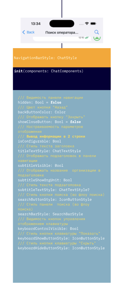 |
ChatLoadingStyle | Общий стиль экрана загрузки чата | 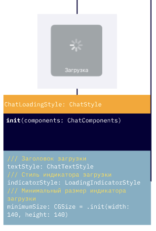 |
ChatPlaceholderStyle | Стиль пустого состояния чата (например, нет сообщений) | 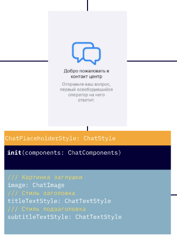 |
ChatPlaceholderErrorStyle | Стиль отображения ошибки (например, не удалось загрузить чат) | 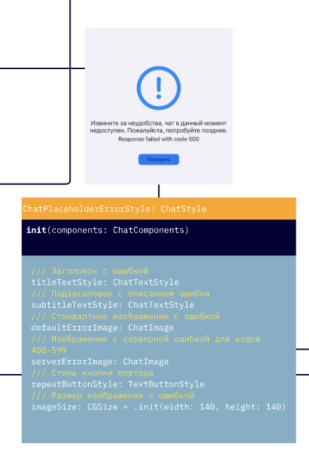 |
LoadingIndicatorStyle | Стиль индикатора загрузки (в сообщениях, действиях) | 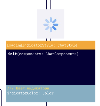 |
ChatInputStyle | Стиль панели ввода сообщений в чате | 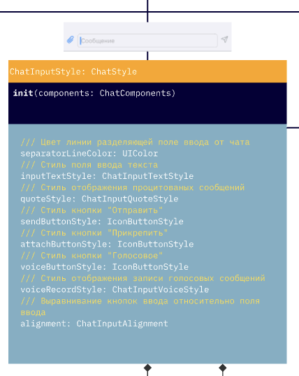 |
ChatInputTextStyle | Стиль контейнера ввода текста | 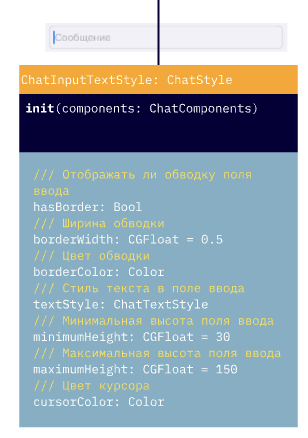 |
ChatInputVoiceStyle | Стиль элемента записи голосовых сообщений | 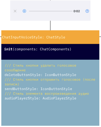 |
ChatInputQuoteStyle | Стиль элемента отображения цитаты над полем ввода | 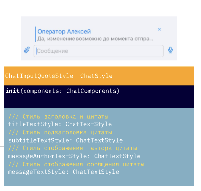 |
SearchBarStyle | Стиль поисковой строки в панели навигации | 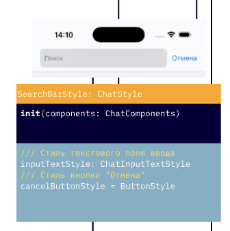 |
ToastAlertStyle | Стиль всплывающих уведомлений (toast) | 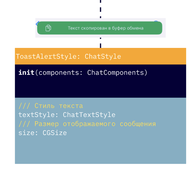 |
ScrollToMessageButtonStyle | Кнопка прокрутки к новым сообщениям. Поддерживает alwaysShow для постоянного отображения | |
ChatMenuStyle | Стиль меню добавления вложений) | 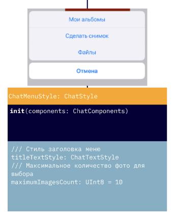 |
ProgressViewStyle | Стиль индикатора прогресса (загрузка файлов и т.п.) | |
ButtonStyle | Базовый стиль кнопки в чате | |
TextButtonStyle | Текстовая кнопка (без фона) | |
IconButtonStyle | Кнопка с иконкой | |
AudioPlayerStyle | Стиль аудиоплеера (в чате или отдельно) |
| Стили сообщений | Описание | Дизайн |
|---|---|---|
ChatMessagesStyles | Контейнер стилей для всех типов пользовательских сообщений | |
ChatMessageStyle | Базовый стиль сообщения в чате | |
TextChatMessageStyle | Стиль текстового сообщения | 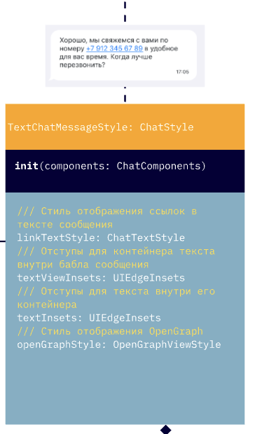 |
FileChatMessageStyle | Стиль сообщения с файлом | 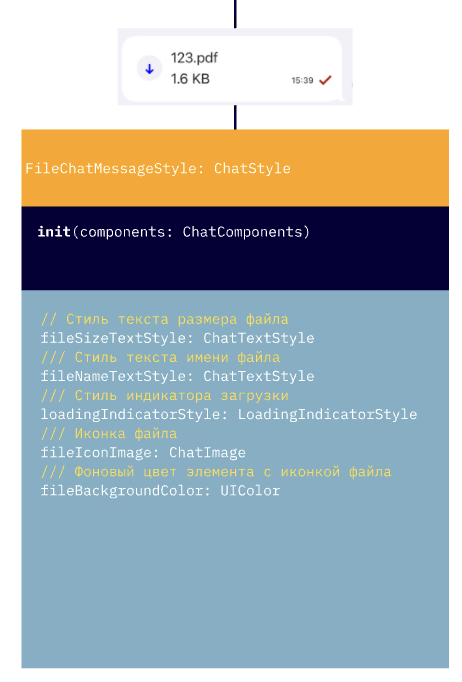 |
SearchChatMessageStyle | Стиль выделения при поиске в сообщениях | 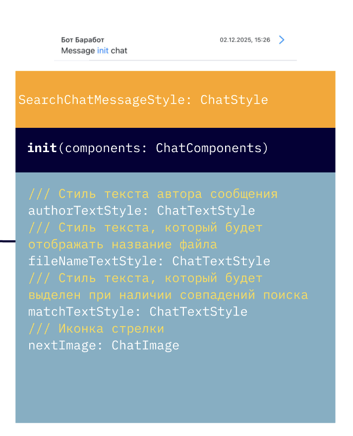 |
ImageChatMessageStyle | Стиль изображения в сообщении | 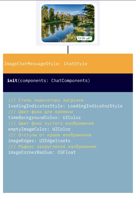 |
AudioChatMessageStyle | Стиль аудиосообщения | 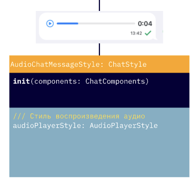 |
SurveyChatMessageStyle | Стиль опроса/голосования в сообщении. В 5.6.0 добавлен questionButtonColor (заменяет устаревший questionBackgroundColor) | 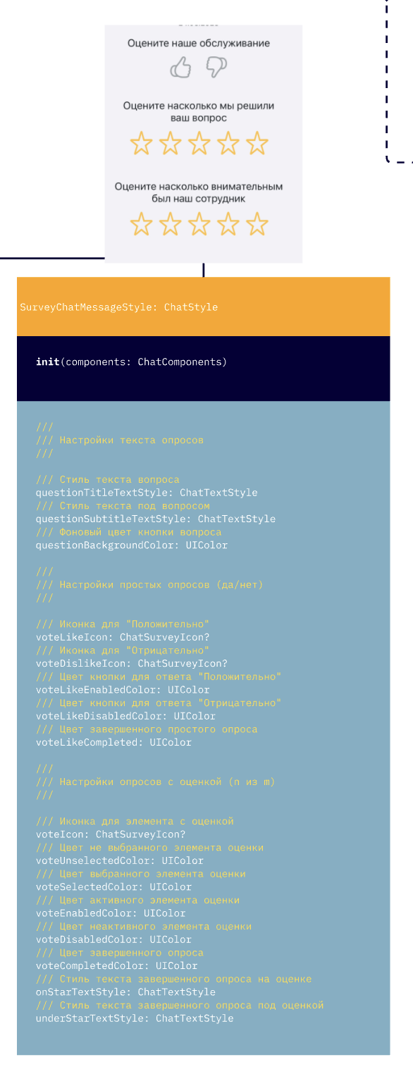 |
ScheduleChatMessageStyle | Стиль сообщения с расписанием/напоминанием | 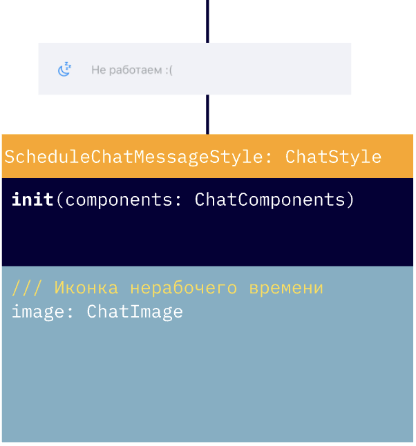 |
OperatorJoinedChatMessageStyle | Стиль сообщения о подключении оператора | 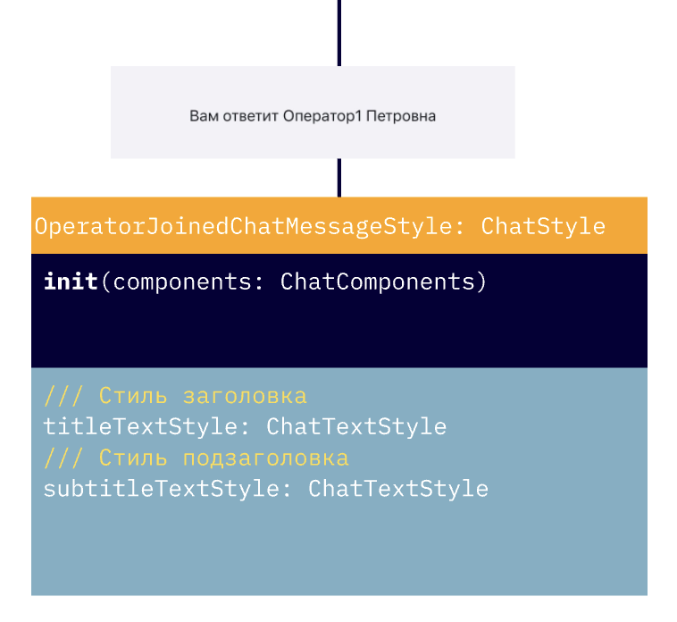 |
QuickReplyStyle | Стиль быстрых ответов | 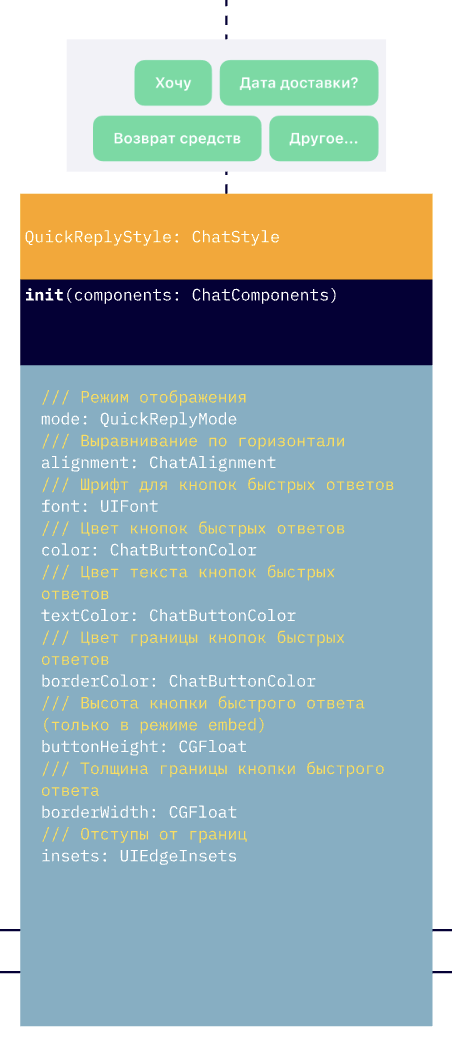 |
QuoteStyle | Стиль отображения цитирования сообщений | 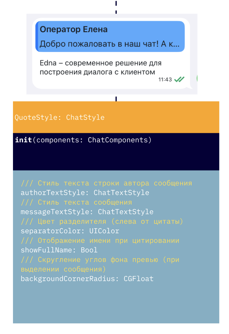 |
OpenGraphViewStyle | Стиль отображения OpenGraph в текстовых сообщениях | 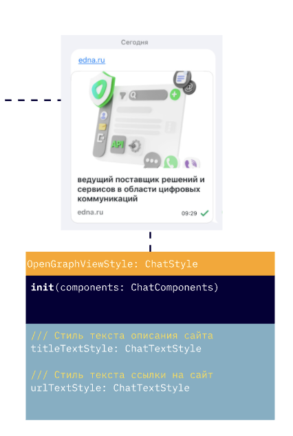 |
У каждого компонента есть общие базовые параметры, описанные в ChatMessageStyle, например:
    /// Стиль текста сообщения
    public lazy var textStyle: ChatTextStyle
    /// Стиль отображения времени сообщения
    public lazy var timeTextStyle: ChatTextStyle

    /// Иконка статуса отредактированного сообщения
    public lazy var editedStatusImage: ChatImage
    /// Иконка статуса отправляемого сообщения
    public lazy var pendingStatusImage: ChatImage
    /// Иконка статуса отправленного сообщения
    public lazy var deliveredStatusImage: ChatImage
    /// Иконка статуса прочитанного сообщения
    public lazy var readStatusImage: ChatImage

    /// Стиль отображения текста ошибки
    public lazy var errorTextStyle: ChatTextStyle
    /// Иконка i у сообщения с ошибкой
    public lazy var errorInfoButton: IconButtonStyle

    /// Цвет статуса при ошибке
    public lazy var errorStatusColor: UIColor = colors.error
    /// Стиль текста даты при ошибке
    public lazy var errorTimeTextStyle: ChatTextStyle

    /// Отступ от края бабла сообщения до конца экрана
    public var messageBubbleEndMargin: CGFloat

    /// Отступ от контейнера  для исходящих сообщений
    public var containerRightOffset: CGFloat
    /// Остступ от контейнера для входящих сообщений
    public var containerLeftOffset: CGFloat
Также у каждого компонента есть уникальные параметры. Полный список можно посмотреть в документации по API.
Стиль можно создать с помощью базового конструктора:
	let outcomeMessages = ChatMessagesStyles(components: components)
	outcomeMessages.textMessageStyle.textStyle.color = .black
    outcomeMessages.showAvatar = showOutcomeAvatar
	outcomeMessages.bubbleErrorColor = .red
или с помощью билдера с замыканием для настройки параметров:
	let outcomeMessages = ChatMessagesStyles.build(with: components) { messagesStyle in
		messagesStyle.textMessageStyle.textStyle.color = .black
		messagesStyle.showAvatar = showOutcomeAvatar
		messagesStyle.bubbleErrorColor = .red
	}
Настройка уже существующего стиля осуществляется через свойства:
    // Получение настроек экрана поиска
    let searchFlow = theme.flows.searchFlow
    searchFlow.navigationBarStyle.hidden = false
    searchFlow.navigationBarStyle.searchBarStyle.cancelButtonStyle.tintColor = .white
    searchFlow.searchMessageStyle.matchTextStyle.color = .red
    searchFlow.notFoundTextStyle = ChatTextStyle(font: typography.message, color: .white)
или с помощью метода apply с настройкой через замыкание:
    // Применение настроек для экрана поиска
    theme.flows.searchFlow.apply {
        $0.navigationBarStyle = NavigationBarStyle.build(with: components, configure: {
            $0.hidden = false
            $0.backButtonColor = .red
        })
        $0.searchMessageStyle.apply {
            $0.matchTextStyle = .init(font: UIFont.systemFont(ofSize: 20), color: .systemGreen)
            $0.nextImage = ChatImage(system: "chevron.forward", tintColor: .systemGreen)
        }
        $0.navigationBarStyle.searchBarStyle.cancelButtonStyle.tintColor = .red
        $0.notFoundTextStyle = ChatTextStyle(font: typography.message, color: .red)
    }
В текущей версии есть ограничение на настройку компонентов (переиспользуемых из ChatComponents) через apply. Их настройка в одном из флоу через apply может приводить к их глобальному изменению в теме. В этом случае рекомендуется точечно создавать новый компонент и настраивать его в нужном месте флоу.
В этой версии дизайн‑система применялась к текущему чату, могли быть учтены не все параметры. В случае обнаружения проблем с настройкой обратитесь в поддержку.