Components
Components are the shared building blocks of a theme (navigation bar, input field, player, and so on). A single component is reused across screens and configured centrally through ChatComponents; in individual flows, its style can be overridden per-screen.
Configuration example:
// Create components with custom colors
let components = ChatComponents(colors: myColors, typography: myTypography)

// Override parameters of components shared across the SDK
components.navigationBarStyle.titleTextStyle.color = .white
// The cancel button in the search bar is the UIKit UISearchBar.cancelButton; because
// of UISearchBar API limitations, only `color.normal` applies.
// `tintColor` and other ButtonStyle properties for this element are ignored —
// see design-system/known_issues.md.
components.searchBarStyle.cancelButtonStyle.color.normal = .white

// Create a theme from components
let theme = ChatTheme(components: components)
or through the build constructor:
let components = ChatComponents.build { components in
    components.searchBarStyle.cancelButtonStyle.color.normal = .black
    components.loadingChatStyle.indicatorStyle.backgroundColor = .systemGray3
    components.loadingChatStyle.indicatorStyle.cornerRadius = 20.0
    components.audioPlayerStyle.playButtonStyle.image = ChatImage(system: "play.fill", tintColor: .red)
    components.audioPlayerStyle.pauseButtonStyle.image = ChatImage(system: "pause.fill", tintColor: .green)
    components.audioPlayerStyle.progressViewStyle.color = .black
    components.audioPlayerStyle.progressViewStyle.backgroundColor = .yellow
}
Constructor parameters (all optional, with default values):
images:ChatImages— images used by the theme.colors:ChatColors— color palette.typography:ChatTypography— font settings.
Chat component styles
| Name | Description |
|---|---|
navigationBarStyle | Navigation bar: title, buttons, background. |
searchBarStyle | Search bar inside navigationBarStyle. |
loadingIndicatorStyle | Loading indicator (spinner). |
loadingChatStyle | Loading screen shown when the chat opens. |
chatPlaceholderStyle | Empty chat placeholder. |
errorPlaceholderStyle | Error screen with a "Retry" button. |
inputTextStyle | Message input text field. |
inputSearchTextStyle | Text field in the search bar. |
audioPlayerStyle | Voice message player. |
inputViewStyle | Bottom chat panel: input field, send and attach buttons. |
chatMenuStyle | File / photo / camera picker menu. |
photoPickerStyle is deprecatedphotoPickerStyle is deprecated; use chatMenuStyle.
Screen anatomy
The screenshots below map visual areas of the iOS chat to fields in ChatComponents, chatFlow, and searchFlow. Captured from the demo app (default light theme). The field structure is the same for any theme.
A style is set globally through components.X (all flows) or per-screen through theme.flows.chatFlow.X / theme.flows.searchFlow.X (one screen). More on priority in the Design system.
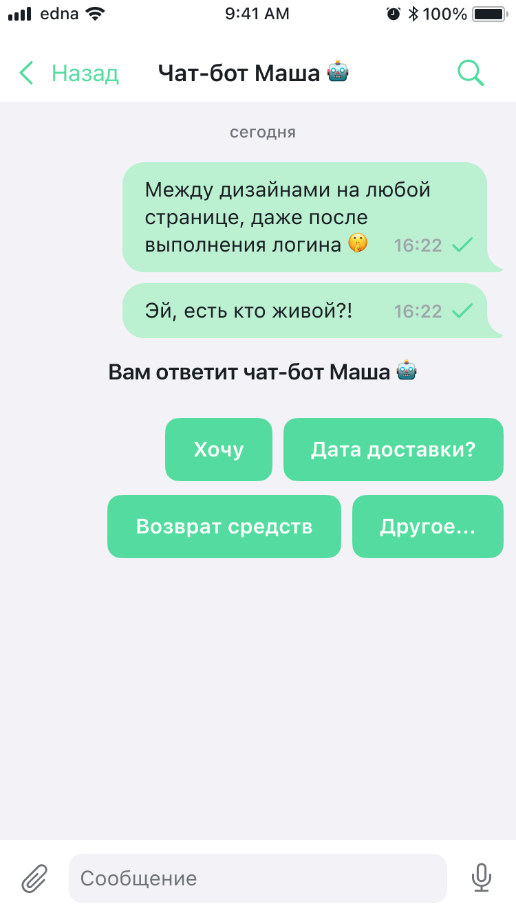
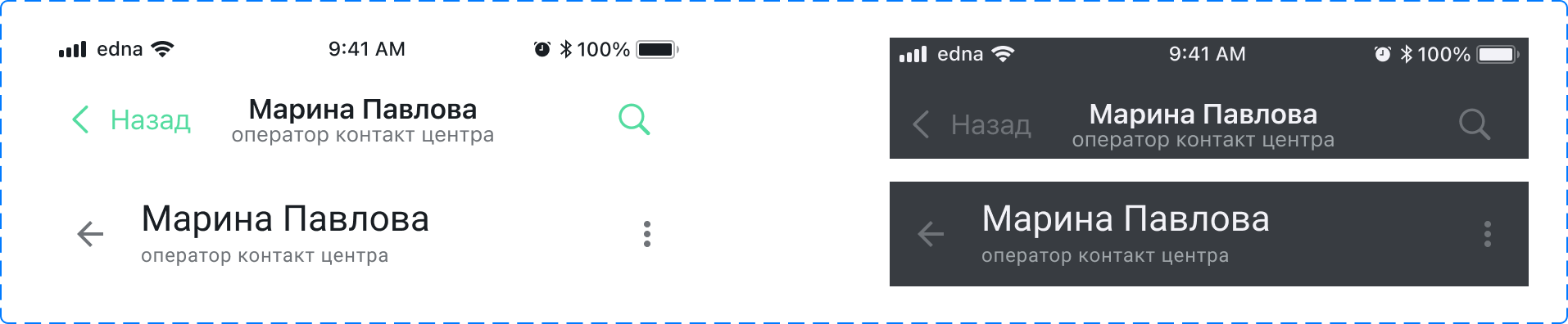
Main chat screen
| Element | Path in themes | Style class |
|---|---|---|
| Navigation "Back" button | chatFlow.navigationBarStyle.backButtonColor | NavigationBarStyle |
| Chat title (operator name) | chatFlow.navigationBarStyle.titleTextStyle | NavigationBarStyle, ChatTextStyle |
| Subtitle (operator role) | chatFlow.navigationBarStyle.subtitleTextStyle | NavigationBarStyle, ChatTextStyle |
| Search icon in the navigation bar | chatFlow.navigationBarStyle.searchButtonStyle | NavigationBarStyle, NavigationBarButtonStyle |
| Chat screen background | chatFlow.backgroundColor | ChatFlow |
| Date separator ("today") | chatFlow.systemMessages.dateMessageStyle | ChatSystemMessagesStyles, ChatTextStyle |
| Outgoing message bubble color | chatFlow.outcomeMessages.bubbleTintColor | ChatMessagesStyles |
| Outgoing message text | chatFlow.outcomeMessages.textMessageStyle.textStyle | TextChatMessageStyle, ChatTextStyle |
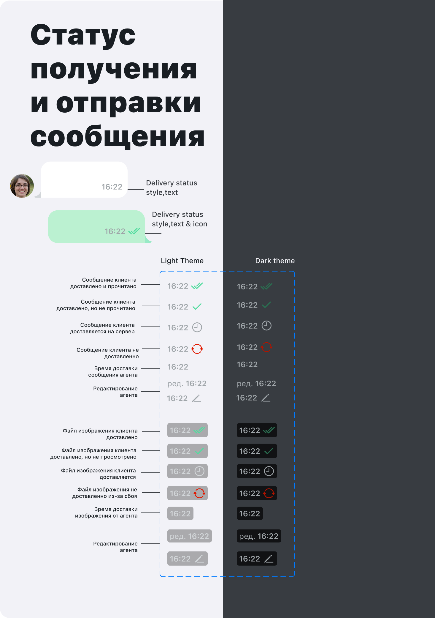
| Status icons (sent / delivered / read) | ChatMessageStyle.pendingStatusImage / deliveredStatusImage / readStatusImage | ChatMessageStyle |
| System message ("You will be answered by…") | chatFlow.systemMessages | ChatSystemMessagesStyles |
| Quick reply buttons | See QuickReplyStyle (Styles) | QuickReplyStyle |
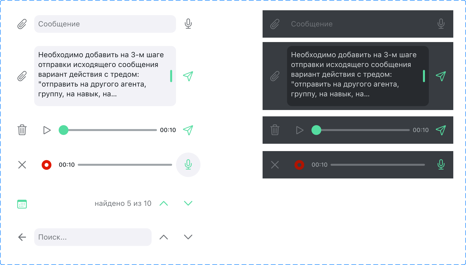
| Message input field | chatFlow.inputViewStyle.inputTextStyle | ChatInputStyle, ChatInputTextStyle |
| Attachment button (clip) | chatFlow.inputViewStyle.attachButtonStyle | ChatInputStyle, IconButtonStyle |
| Microphone button (inactive state) | chatFlow.inputViewStyle.voiceButtonStyle | ChatInputStyle, IconButtonStyle |
| Send button | chatFlow.inputViewStyle.sendButtonStyle | ChatInputStyle, IconButtonStyle |
| Quick reply buttons | chatFlow.quickRepliesStyle | QuickReplyStyle |
Message context menu
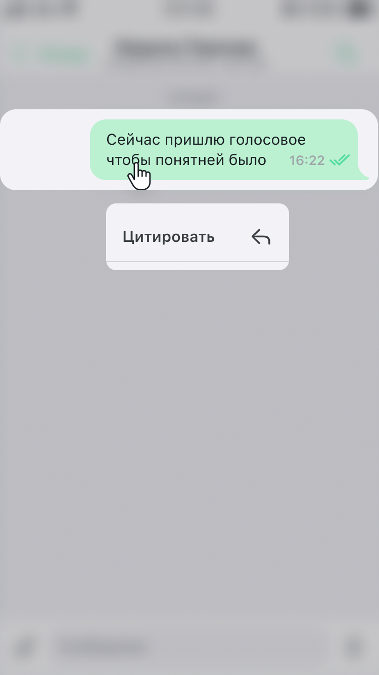
The menu appears on a long press on a message; the set of actions ("Quote", "Copy", "Delete") depends on the message state and server configuration.
| Element | Path in themes | Style class |
|---|---|---|
| Selected message bubble | chatFlow.outcomeMessages / incomeMessages | ChatMessagesStyles |
| Menu actions ("Quote", etc.) | Not configurable through the SDK — rendered through system UIKit (UIMenu/UIMenuController) | — |
Message search

| Element | Path in themes | Style class |
|---|---|---|
| Search bar | searchFlow.navigationBarStyle.searchBarStyle | SearchBarStyle |
| Text and cursor in the search field | components.inputSearchTextStyle | ChatInputTextStyle |
| "Cancel" button | searchFlow.navigationBarStyle.searchBarStyle.cancelButtonStyle.color.normal | ChatButtonColor |
| Search screen background | searchFlow.backgroundColor | ChatUserFlow |
| "Nothing found" illustration | ChatImages.searchNotFoundPlaceholderImage | ChatImages |
| "Nothing found" text | searchFlow.notFoundTextStyle | ChatTextStyle |
Search results
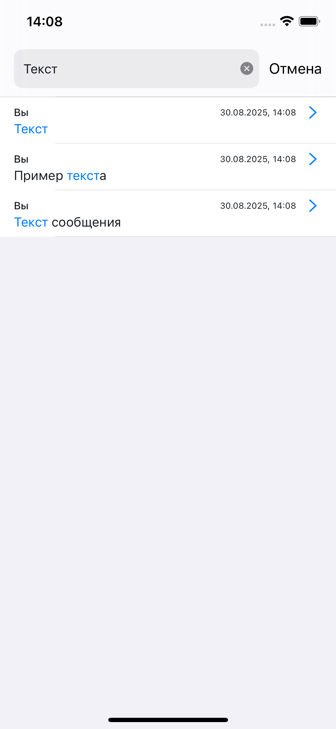
| Element | Path in themes | Style class |
|---|---|---|
| Match highlight in the text | searchFlow.searchMessageStyle.matchTextStyle | SearchChatMessageStyle, ChatTextStyle |
| Result row style (name, date, preview) | searchFlow.searchMessageStyle | SearchChatMessageStyle |
| Clear search field button (×) | searchFlow.navigationBarStyle.searchBarStyle | SearchBarStyle |
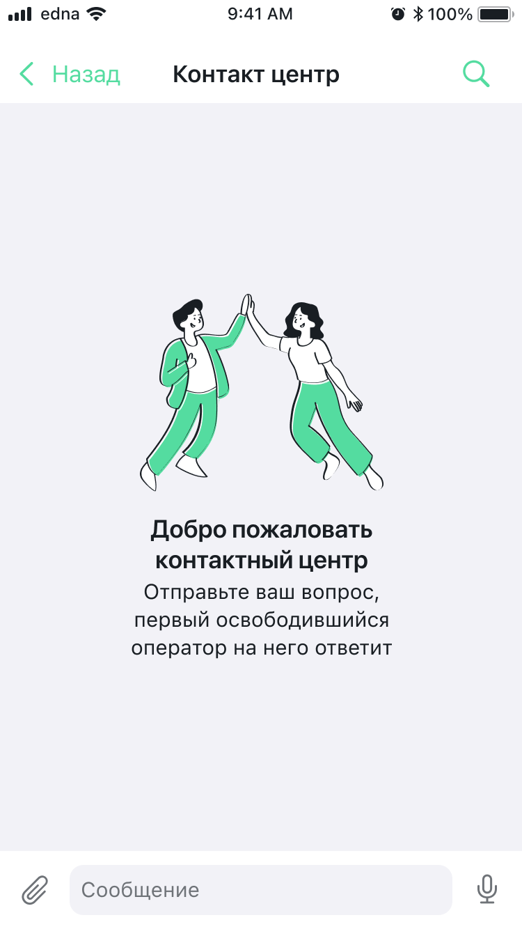
Empty chat state
| Element | Path in themes | Style class |
|---|---|---|
| Welcome illustration | ChatImages.emptyChatPlaceholderImage | ChatImages |
| "Welcome…" title | components.chatPlaceholderStyle.titleTextStyle | ChatPlaceholderStyle, ChatTextStyle |
| Subtitle (description) | components.chatPlaceholderStyle.subtitleTextStyle | ChatPlaceholderStyle, ChatTextStyle |
Illustration (through ChatPlaceholderStyle) | components.chatPlaceholderStyle.image | ChatPlaceholderStyle, ChatImage |
| Screen background | chatFlow.backgroundColor | ChatFlow |
Chat loading
| Element | Path in themes | Style class |
|---|---|---|
| Spinner indicator | components.loadingChatStyle.indicatorStyle | ChatLoadingStyle, LoadingIndicatorStyle |
| "Loading" text | components.loadingChatStyle.textStyle | ChatLoadingStyle, ChatTextStyle |
| Loader background | components.loadingChatStyle.indicatorStyle.backgroundColor | LoadingIndicatorStyle |
Chat initialization error
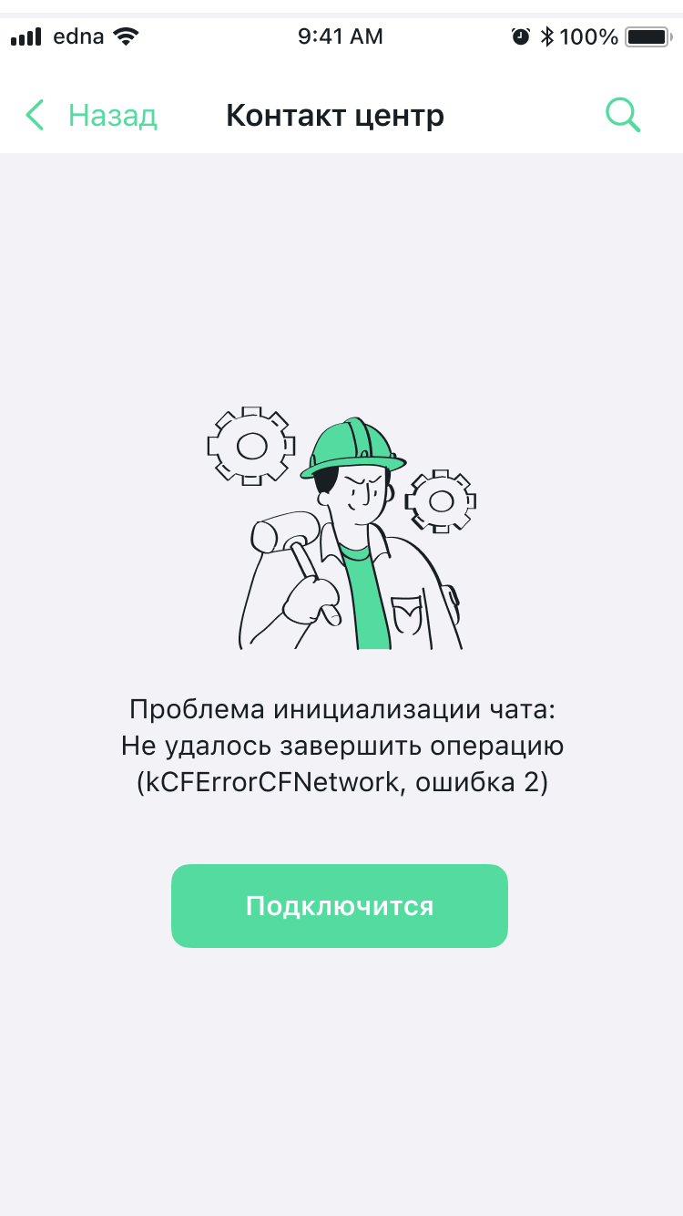
| Element | Path in themes | Style class |
|---|---|---|
| Default error illustration | components.errorPlaceholderStyle.defaultErrorImage | ChatPlaceholderErrorStyle, ChatImage |
| Server error illustration (HTTP 4xx/5xx) | components.errorPlaceholderStyle.serverErrorImage | ChatPlaceholderErrorStyle, ChatImage |
| Error title | components.errorPlaceholderStyle.titleTextStyle | ChatPlaceholderErrorStyle, ChatTextStyle |
| Error subtitle | components.errorPlaceholderStyle.subtitleTextStyle | ChatPlaceholderErrorStyle, ChatTextStyle |
| "Retry" button — background color | components.errorPlaceholderStyle.repeatButtonStyle.color.normal | TextButtonStyle, ChatButtonColor |
| "Retry" button — text color | components.errorPlaceholderStyle.repeatButtonStyle.titleTextStyle.color | TextButtonStyle, ChatTextStyle |
Voice message recording
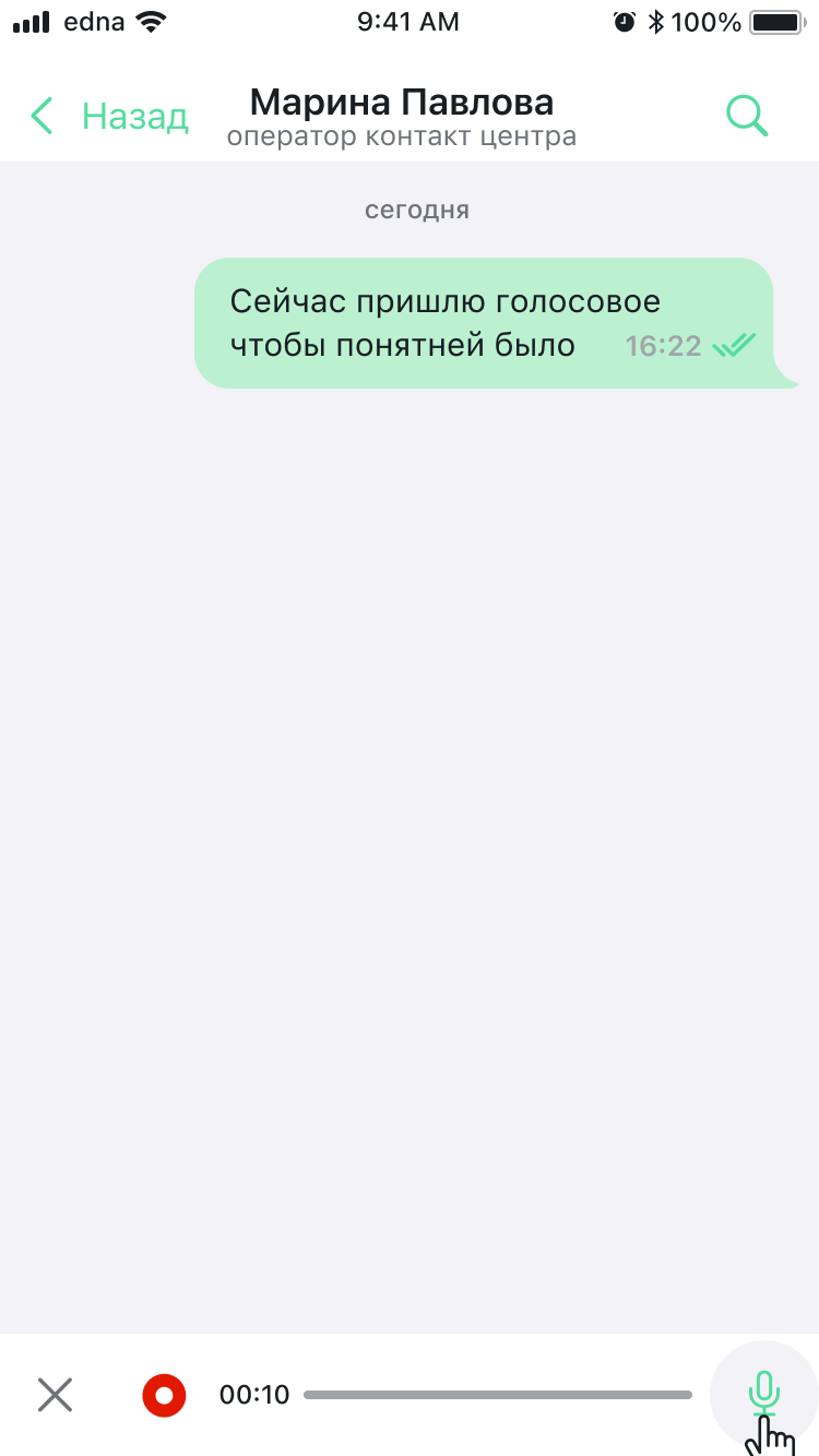
| Element | Path in themes | Style class |
|---|---|---|
| Microphone button (recording trigger) | chatFlow.inputViewStyle.voiceButtonStyle | ChatInputStyle, IconButtonStyle |
| Recording style as a whole (cancel, timer, progress) | chatFlow.inputViewStyle.voiceRecordStyle | ChatInputStyle, ChatInputVoiceStyle |
| Recording cancel button (×) — inside voice mode | chatFlow.inputViewStyle.voiceRecordStyle (see Styles) | ChatInputVoiceStyle |
Dialog completion and rating
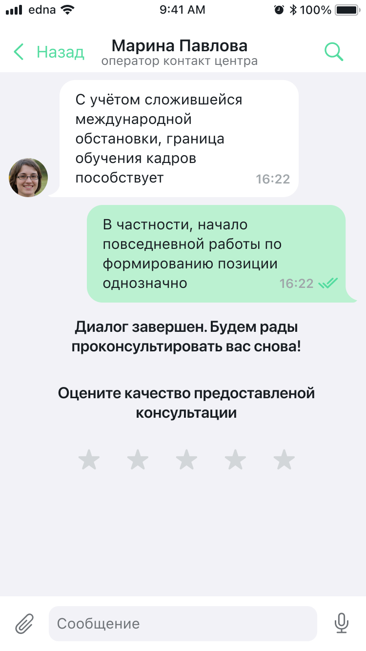
| Element | Path in themes | Style class |
|---|---|---|
| Operator avatar on the incoming message | chatFlow.incomeMessages.showAvatar (on/off) | ChatMessagesStyles |
| Style of the "Dialog ended…" system message | chatFlow.systemMessages.dateMessageStyle (for neutral system text) | ChatSystemMessagesStyles, ChatTextStyle |
| Rating invitation title | chatFlow.systemMessages.surveyMessageStyle.questionTitleTextStyle | SurveyChatMessageStyle, ChatTextStyle |
| Invitation subtitle | chatFlow.systemMessages.surveyMessageStyle.questionSubtitleTextStyle | SurveyChatMessageStyle, ChatTextStyle |
| Star icon (selected / unselected) | chatFlow.systemMessages.surveyMessageStyle.voteIcon | SurveyChatMessageStyle, ChatSurveyIcon |
| Star color (selected / unselected) | voteSelectedColor / voteUnselectedColor | SurveyChatMessageStyle, UIColor |
| Like/dislike icons (for a binary survey) | voteLikeIcon / voteDislikeIcon | SurveyChatMessageStyle, ChatSurveyIcon |
The full property list is in Styles and Flows. If a field is not in the SDK public API, it is not configurable — see Known issues.
Customization examples for typical elements
Text input field
components.inputTextStyle.apply { style in
    style.cursorColor     = UIColor(named: "BrandColor") ?? .systemBlue  // cursor
    style.textStyle.color = .label                                       // text color
    style.backgroundColor = .systemBackground
}
Or only on the chat screen (without affecting search):
let customInput = ChatInputTextStyle.build(with: components) { style in
    style.cursorColor = UIColor(named: "BrandColor") ?? .systemBlue
}
theme.flows.chatFlow.inputViewStyle.inputTextStyle = customInput
Navigation bar
components.navigationBarStyle.apply { style in
    style.titleTextStyle.font  = .systemFont(ofSize: 17, weight: .semibold)
    style.titleTextStyle.color = .white
    style.backgroundColor      = UIColor(named: "BrandColor") ?? .systemBlue
}
The behavior depends on the isConfigurable flag in NavigationBarStyle:
isConfigurable=true— custom title: alltitleTextStyleproperties (font + color) andsubtitleTextStyleapply.isConfigurable=false— standard UIKit nav bar: onlytitleTextStyle.colorapplies (throughtitleTextAttributes). ThetitleTextStyle.fontand the entiresubtitleTextStyleare ignored.
Message bubble color
// Incoming (from the operator)
theme.flows.chatFlow.incomeMessages.bubbleTintColor  = UIColor(named: "BubbleIncoming") ?? .systemGray5
// Outgoing (from the client)
theme.flows.chatFlow.outcomeMessages.bubbleTintColor = UIColor(named: "BrandColor") ?? .systemBlue
// Bubble text color
theme.flows.chatFlow.incomeMessages.textMessageStyle.textStyle.color  = .label
theme.flows.chatFlow.outcomeMessages.textMessageStyle.textStyle.color = .white
The bubbleErrorColor property in ChatMessagesStyles applies only to outgoing messages (from the client). Incoming messages do not show the error in the bubble color.
Send button
let customInput = ChatInputStyle.build(with: components) { style in
    // The icon color is set in the ChatImage itself; background/state colors — through `color`.
    style.sendButtonStyle.image            = ChatImage(system: "paperplane.fill", tintColor: .white)
    style.sendButtonStyle.color.normal     = UIColor(named: "BrandColor") ?? .systemBlue
    style.sendButtonStyle.color.disabled   = .systemGray3
}
theme.flows.chatFlow.inputViewStyle = customInput
Button colors (ChatButtonColor)
Sets the button color in three states: normal, highlighted, disabled. Used in ButtonStyle, IconButtonStyle, NavigationBarButtonStyle, TextButtonStyle.
let buttonColor = ChatButtonColor(
    normal: .systemBlue,           // normal state
    highlighted: .systemBlue.withAlphaComponent(0.7),  // when pressed
    disabled: .systemGray3         // disabled button
)
All three states are required. By default they are derived from the ChatColors palette:
| State | Default color |
|---|---|
normal | colors.link |
highlighted | colors.linkLight |
disabled | colors.disabled |
You can apply custom colors either at construction time or through properties:
buttonColor.normal = UIColor(named: "BrandColor") ?? .systemBlue
Search bar
components.searchBarStyle.apply { style in
    // For the cancel button in the search bar, only color.normal applies;
    // the `tintColor` of SearchBarStyle itself and other ButtonStyle properties
    // for this element are ignored (see known_issues.md).
    style.cancelButtonStyle.color.normal = .white
    // The cursor and text of the search field are configured through inputSearchTextStyle
    // (see the "Search input field" section below).
}
Loading indicator
components.loadingIndicatorStyle.apply { style in
    style.indicatorColor = UIColor(named: "BrandColor") ?? .systemBlue
}
Chat loading screen
components.loadingChatStyle.apply { style in
    style.indicatorStyle.backgroundColor = .systemGray6
    style.indicatorStyle.cornerRadius = 16.0
}
Empty chat state
// Text when the chat is empty
components.chatPlaceholderStyle.apply { style in
    style.titleTextStyle.color = .secondaryLabel
    style.titleTextStyle.font  = .systemFont(ofSize: 15, weight: .regular)
}

// Replace the illustration (through the images token)
let images = ChatImages()
images.emptyChatPlaceholderImage = ChatImage(named: "EmptyChat", bundle: .main)
Loading error
components.errorPlaceholderStyle.apply { style in
    style.titleTextStyle.color = .label
    // "Retry" button background color — through ChatButtonColor (state-aware).
    // The type of repeatButtonStyle is TextButtonStyle, and the UI reads color.normal,
    // not tintColor.
    style.repeatButtonStyle.color.normal = UIColor(named: "BrandColor") ?? .systemBlue
    style.repeatButtonStyle.titleTextStyle.color = .white
}

// Replace the error illustration (through the token)
images.errorPlaceholderImage = ChatImage(named: "ErrorIllustration", bundle: .main)
Audio player
components.audioPlayerStyle.apply { style in
    style.playButtonStyle.image  = ChatImage(system: "play.fill",  tintColor: UIColor(named: "BrandColor") ?? .systemBlue)
    style.pauseButtonStyle.image = ChatImage(system: "pause.fill", tintColor: UIColor(named: "BrandColor") ?? .systemBlue)
    style.progressViewStyle.color           = UIColor(named: "BrandColor") ?? .systemBlue
    style.progressViewStyle.backgroundColor = .systemGray5
}
Search input field
components.inputSearchTextStyle.apply { style in
    style.cursorColor     = UIColor(named: "BrandColor") ?? .systemBlue
    style.textStyle.color = .label
}
Figma and SDK mapping
On the Components page in Figma, components are organized into 8 sections. Below is the mapping between Figma sections and SDK styles:
Navigation (Figma)
| Figma component | Variants | SDK style |
|---|---|---|
| Top Navigation | iOS/Android × Light/Dark | navigationBarStyle (NavigationBarStyle) |
| Bottom Input | Empty, Filled, Voice Record, Voice Recorded, Search Navigation | inputViewStyle (ChatInputStyle) |
| Cite Bottom | Message / Photo / Docs × Light/Dark | chatFlow.inputViewStyle.quoteStyle (ChatInputQuoteStyle) |
| Scroll Button | Light / Dark | chatFlow.scrollToTopUnreadMessagesButtonStyle and chatFlow.scrollToBottomUnreadMessagesButtonStyle (ScrollToMessageButtonStyle) |
| Badge | Single / Numerous × Light/Dark | The visual style of the badge is not publicly configurable in the SDK; the unread count is available through getUnreadMessagesCount and the delegate |
Status (Figma)
| Figma component | Variants | SDK style |
|---|---|---|
| Message status | Read, Delivered, Sending, Error, Edited (Client/Agent, with/without backplate) | ChatMessageStyle: readStatusImage, deliveredStatusImage, pendingStatusImage, editedStatusImage, errorStatusColor |
Button (Figma)
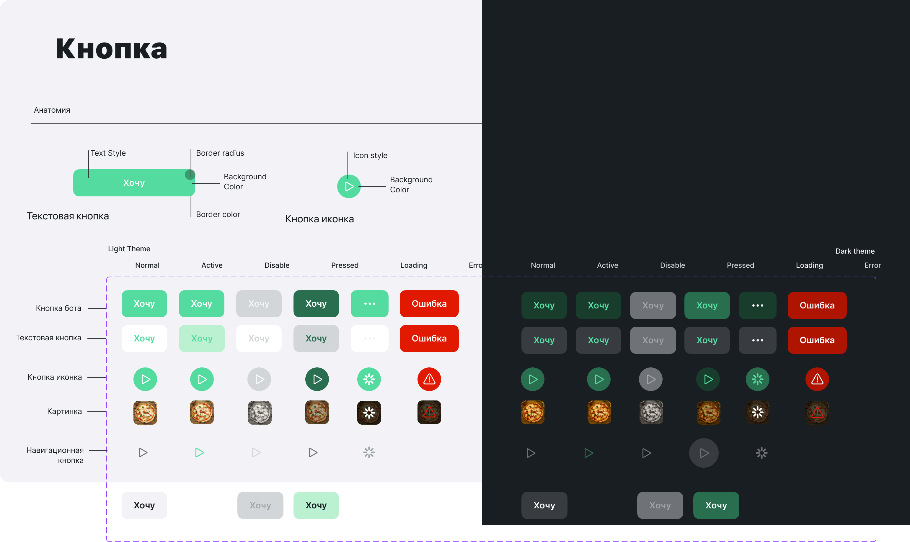
| Button type (Figma) | States | SDK style |
|---|---|---|
| Bot | Normal, Active, Pressed, Disable, Loading, Error | QuickReplyStyle |
| Text | Normal, Active, Pressed, Disable, Loading, Error | TextButtonStyle |
| Icon | Normal, Active, Pressed, Disable, Loading, Error | IconButtonStyle |
| Image | Normal, Active, Pressed, Disable, Loading, Error | ButtonStyle |
| Selection | Normal, Pressed, Disable | QuickReplyStyle |
Bubbles (Figma)
| Figma component | Variants | SDK style |
|---|---|---|
| Message Base (Agent) | Normal, MultiContent, Deleted, Search agent, Error | chatFlow.incomeMessages (ChatMessagesStyles) |
| Message Base (Client) | Normal, MultiContent, Error | chatFlow.outcomeMessages (ChatMessagesStyles) |
| System messages | Snooze, date, survey, operator connected | chatFlow.systemMessages (ChatSystemMessagesStyles) |
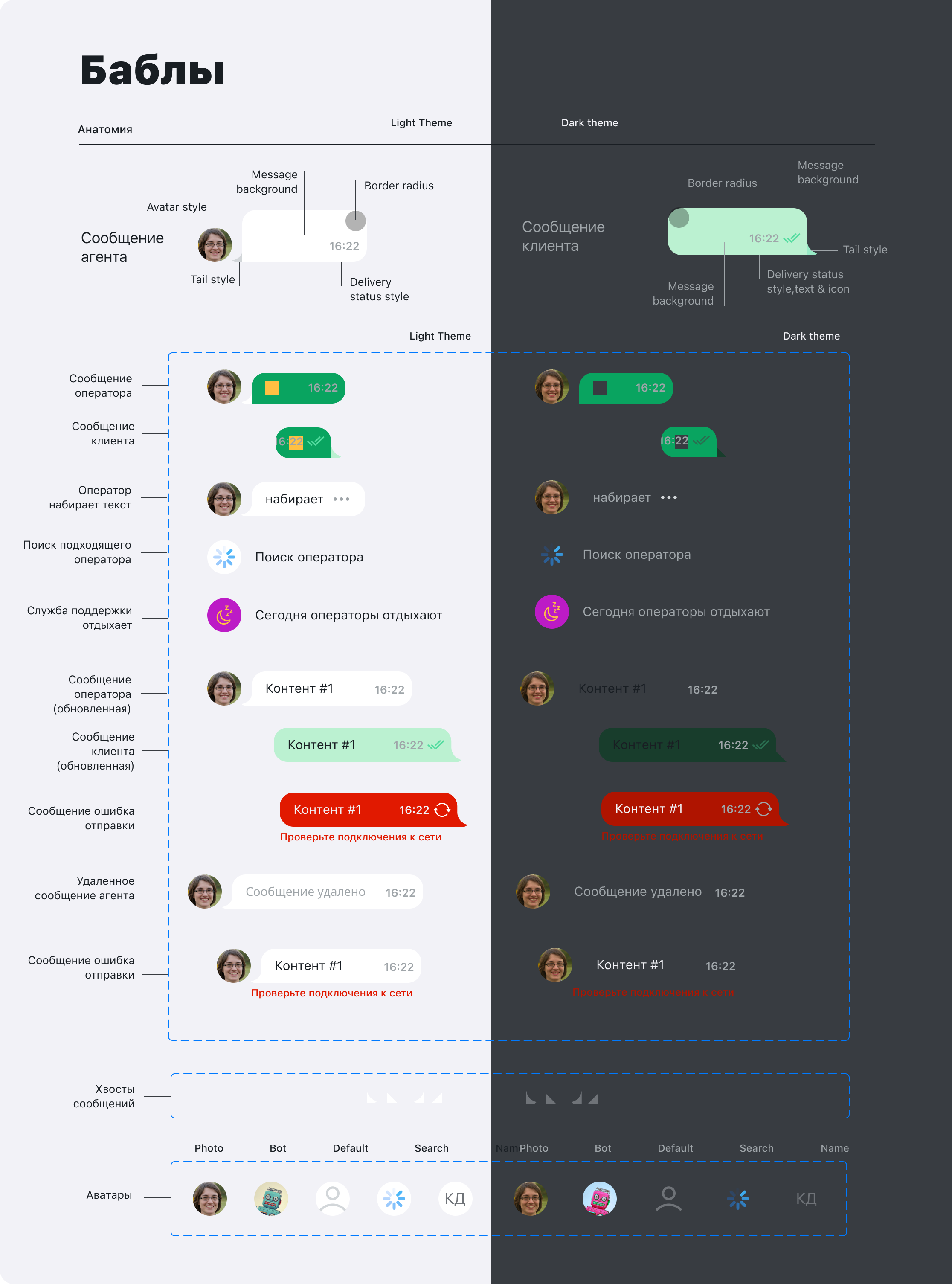
Bubble anatomy in Figma: Avatar → Tail → Content (text/media) → Status. Configured through:
ChatMessagesStyles.showAvatar— show the avatarChatMessageStyle.messageBubbleEndMargin— margin from the screen edgeChatMessageStyle.containerLeftOffset/containerRightOffset— container offsets
Figma states → SDK properties
| Figma state | Description | SDK property |
|---|---|---|
| Normal | Regular message | textMessageStyle, imageMessageStyle, bubbleTintColor |
| Typing | "Typing" indicator | Style not publicly configurable |
| Snooze | Operator temporarily unavailable | chatFlow.systemMessages.scheduleMessageStyle (ScheduleChatMessageStyle) |
| Search agent | Search result with highlighting | searchFlow.searchMessageStyle (SearchChatMessageStyle) |
| Error | Send error | ChatMessageStyle.errorStatusColor, errorTextStyle, errorInfoButton |
| Deleted | Deleted message | ChatMessagesStyles.deletedTextStyle (ChatTextStyle) |
Input Field (Figma)
| Figma component | Variants | SDK style |
|---|---|---|
| Input field | Empty, partially filled, completely filled | inputTextStyle (ChatInputTextStyle) |
OS UI (Figma)
| Figma component | Description | SDK style |
|---|---|---|
| iOS Select File | System file picker | chatMenuStyle (ChatMenuStyle) |
| Gallery | Photo gallery | chatMenuStyle |
| Select Image | Image selection | chatMenuStyle |
Content (Figma)
| Figma component | Description | SDK style |
|---|---|---|
| Content | Message content types: text, image, file, audio, survey, quote, OG preview, and others | TextChatMessageStyle, ImageChatMessageStyle, FileChatMessageStyle, AudioChatMessageStyle, SurveyChatMessageStyle, QuoteStyle, OpenGraphViewStyle |
Illustration (Figma)
| Figma component | Variants | SDK style |
|---|---|---|
| Illustration | Welcome, Search, Error, and others | emptyChatPlaceholderImage, errorPlaceholderImage, searchNotFoundPlaceholderImage (in ChatImages) |
Attachment menu (chatMenuStyle)
chatMenuStyle controls the appearance of the file, photo, and camera picker menu — the action sheet that appears when the attachment button is pressed.
Available properties
The menu is implemented through the system UIAlertController, so only three properties have a visual effect:
| Property | Type | Description | Default |
|---|---|---|---|
backgroundColor | UIColor | Menu sheet background | colors.background |
titleTextStyle.color | UIColor | Text and icon color of buttons (forwarded to alert.view.tintColor) | colors.link |
maximumImagesCount | UInt8 | Maximum number of selectable images | 10 |
tintColor, cornerRadius, titleTextStyle.fontThese fields are present on ChatMenuStyle (inherited from ChatStyle / ChatTextStyle), but because of the system UIAlertController implementation, they have no visual effect. Set the color through titleTextStyle.color; corner rounding is managed by the system.
Configuration example
// Globally through ChatComponents (applied across all screens)
components.chatMenuStyle.apply { style in
    style.backgroundColor      = UIColor(named: "BackgroundPrimary") ?? .white
    style.titleTextStyle.color = UIColor(named: "BrandColor") ?? .systemBlue
}
Or through build to create a new instance:
let menuStyle = ChatMenuStyle.build(with: components) { style in
    style.backgroundColor      = .white
    style.titleTextStyle.color = .systemBlue
    style.maximumImagesCount   = 5
}
components.chatMenuStyle = menuStyle
Chat screen only
If you need to change the menu style only in the chat (without affecting other screens):
// Access through chatFlow (the property is called addFileMenuStyle)
theme.flows.chatFlow.addFileMenuStyle.apply { style in
    style.backgroundColor      = UIColor(named: "BackgroundPrimary") ?? .white
    style.titleTextStyle.color = UIColor(named: "BrandColor") ?? .systemBlue
}
chatMenuStyleWhen ChatFlow is created, the addFileMenuStyle property is initialized with a reference to the same instance held in components.chatMenuStyle at the moment the theme is initialized. After that they are independent: if you later run components.chatMenuStyle = newStyle, it does not affect chatFlow.addFileMenuStyle — the previous object remains there.
To change the menu only in chatFlow without a global effect, create a new instance through build and assign it directly: theme.flows.chatFlow.addFileMenuStyle = myMenuStyle.