Components and flows (ChatComponents, ChatFlows)
Below are the most frequently used ChatComponents and ChatFlows fields, grouped by visual chat elements with screenshots. The full list of public classes, properties, and enums is in Dokka documentation.
Specific flows (Search, Gallery, Files, etc.) and the basic concept of customization levels are on separate pages: Flows, Introduction to the design system. Some ChatConfig parameters in 5.x are controlled by server configuration — see Known limitations.
Style map by flow
A brief overview of the root fields through which the chat's appearance is configured. A detailed mapping of UI elements to fields is in the UI–theme field mapping section.
| Root path | What it styles | Style class |
|---|---|---|
chatFlow.navigationBar | Chat toolbar: title, subtitle, icons, status bar color | NavigationBarStyle |
chatFlow.inputView | Input field and surrounding buttons (attach, voice, send) | InputViewStyle |
chatFlow.incomeMessages / outcomeMessages / errorMessages | Style of incoming, outgoing, and error messages | MessagesConfig |
chatFlow.systemMessages | System messages (operator join/leave, requests) | SystemMessagesConfig |
chatFlow.systemMessages.ratingStyle | Texts for invitation and thanks for rating, star rendering (5-star rating) | RatingStyle |
chatFlow.welcomeScreenStyle | Welcome screen when history is empty | WelcomeScreenStyle |
chatFlow.quoteView | Quote in the input field and inside messages | QuoteViewStyle |
chatFlow.surveyStyle | Survey icon appearance: stars (optionsSurvey*) and like/dislike thumbs (binarySurvey*) | SurveyStyle |
chatFlow.buttonSurveyButton / buttonSurveyQuestion | Button survey | TextMessageStyle |
chatFlow.messagePopupMenuStyle | Context menu on long-press of a message | MessagePopupMenuStyle |
chatFlow.permissionDescriptionPopupStyle | Window describing requested permissions | PermissionDescriptionPopupStyle |
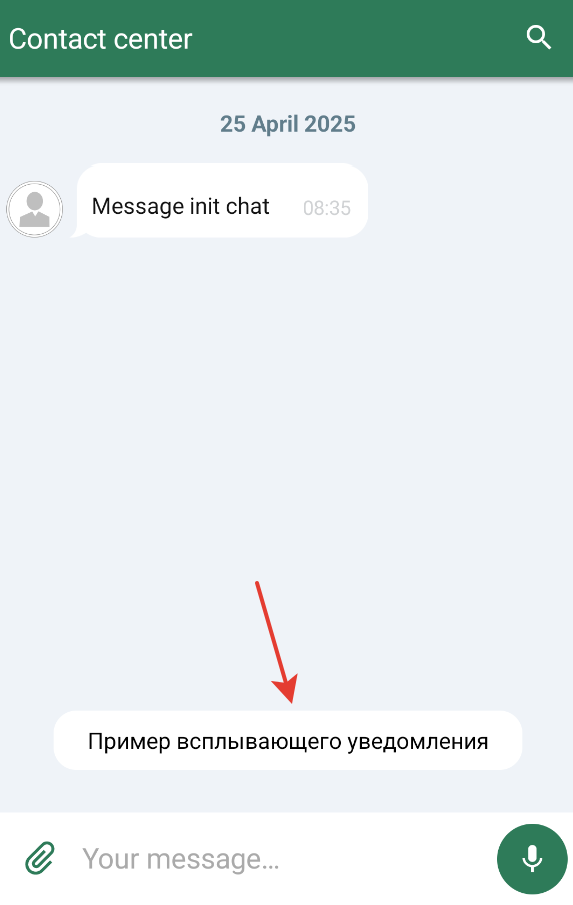
chatFlow.smallPushes / chatFlow.bigPushes | Chat push notifications | PushesChatStyle |
chatFlow.scrollDownButton / chatFlow.scrollUpButton | Message list scroll buttons | ImagesChatStyle |
chatFlow.chip | Chip plates (dates, quick replies) | TextMessageStyle |
chatFlow.loader | Progress bar on chat start | LoaderChatStyle |
chatFlow.retryChatInitButton / errorScreenMessage / errorScreenImage | Chat initialization error screen | TextButtonChatStyle, TextMessageStyle, ImagesChatStyle |
chatComponents.balloonComponent | Style of popup balloon messages (Snackbar) | BalloonsChatStyle, BalloonComponent |
chatComponents.pushesComponent | Basic push notification styling (color, icon, title) | PushesComponent |
searchFlow.searchBar / searchBar.searchResultsStyle | Message search and results list | SearchChatComponent, SearchResultsStyle |
imageFlow.imagePlaceholderResId | Placeholder for an unavailable image | ImageFlow |
Quickstart
A minimal customization example — set brand colors and assemble a theme:
val brandColors = ChatColors(
    toolbar = R.color.your_brand_main,
    incomingBubble = R.color.your_incoming_bubble,
    outgoingBubble = R.color.your_outgoing_bubble,
)

val brandTheme = ChatTheme(
    ChatFlows(
        ChatComponents(
            context = applicationContext,
            colors = brandColors,
        )
    )
)
Ready-made scenarios are in the Common customization scenarios section. The complete UI element to theme field mapping is in the section below.
UI–theme field mapping
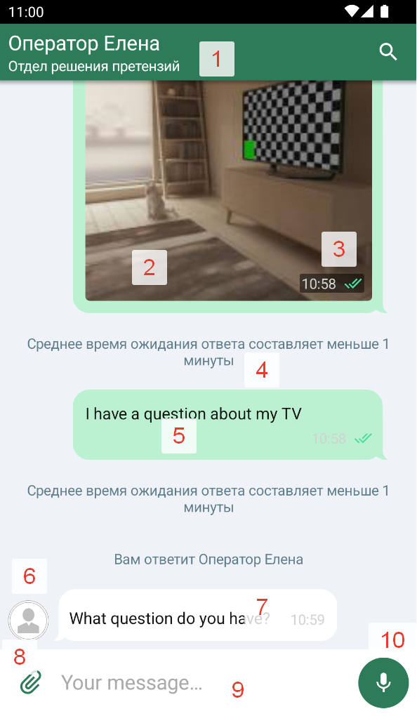
The screenshots below map the visual chat elements to ChatComponents and ChatFlows fields.
Main chat elements
| № | Element | Path in themes | Style / component class |
|---|---|---|---|
| 1.1 | Toolbar title | chatFlow.navigationBar.toolbarHeaderText | NavigationBarStyle |
| 1.2 | Toolbar subtitle | chatFlow.navigationBar.toolbarSubtitleText | NavigationBarStyle |
| 1.3 | Formatted title (Spannable) | chatFlow.navigationBar.toolbarSpannableHeaderText | NavigationBarStyle |
| 1.4 | Toolbar search icon | searchFlow.searchBar.searchIcon | SearchChatComponent |
| 1.5 | Navigation bar background color | chatFlow.navigationBar.backgroundColor | NavigationBarStyle |
| 1.6 | Status bar color | chatFlow.navigationBar.statusBarColor | NavigationBarStyle |
| 1.7 | Toolbar shadow | chatFlow.navigationBar.visibleShadow (Boolean) | NavigationBarStyle |
| 1.8 | Toolbar text centering | chatFlow.navigationBar.centerToolbarText (Boolean) | NavigationBarStyle |
| 1.9 | "Back" button enabled | chatFlow.navigationBar.closeButtonEnabled (Boolean) | NavigationBarStyle |
| 1.10 | Subtitle visibility | chatFlow.navigationBar.chatSubtitleEnabled (Boolean) | NavigationBarStyle |
| 1.11 | "Back" button style | chatFlow.navigationBar.backButton | NavigationBarStyle |
| 1.12 | Search button style | chatFlow.navigationBar.searchButton | NavigationBarStyle |
| 2.1 | Image in a message | chatFlow.incomeMessages.image / outcomeMessages.image | ImageMessageStyle, ImageComponent |
| 2.2 | Chat bubble (general style) | chatFlow.incomeMessages.chatBubble / outcomeMessages.chatBubble | BubblesChatStyle, BubbleComponent |
| 2.3 | Message status icons | chatFlow.outcomeMessages.statusIcons | MessageStatusesStyle, MessageStatusesComponent |
| 3 | Time in a message with an image | chatFlow.outcomeMessages.imagesTimeText | MessagesConfig, TextComponent |
| 4 | System message style | chatFlow.systemMessages.systemMessageText | SystemMessagesConfig, TextComponent |
| 5 | Outgoing message style (container) | chatFlow.outcomeMessages | MessagesConfig |
| 6 | Operator avatar | imageFlow | ImageFlow, ImageComponent |
| 7 | Incoming message style (container) | chatFlow.incomeMessages | MessagesConfig |
| 8 | Attach button | chatFlow.inputView.attachButton | InputViewStyle, IconButtonComponent |
| 9 | Message input field | chatFlow.inputView.textInput | InputViewStyle, InputTextComponent |
| 10.1 | Voice recording button | chatFlow.inputView.voiceButton | InputViewStyle, IconButtonComponent |
| 10.2 | Send button | chatFlow.inputView.sendButton | InputViewStyle, IconButtonComponent |
Behavior on message selection
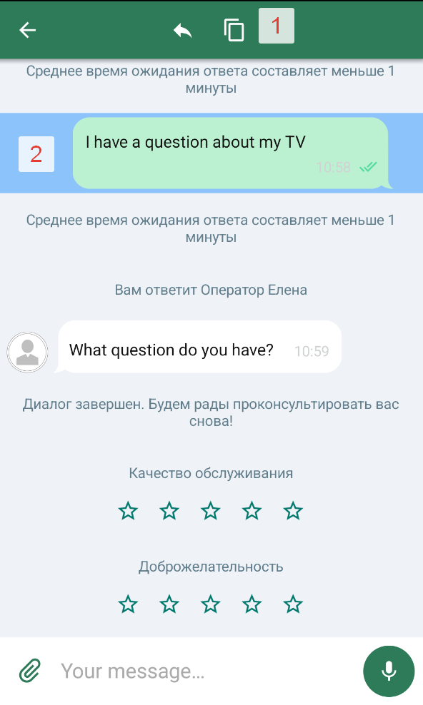
| № | Element | Path in themes | Style class |
|---|---|---|---|
| 1 | "Copy" button | chatFlow.navigationBar.copyButton | NavigationBarStyle |
| 2 | "Reply with quote" button | chatFlow.navigationBar.replyButton | NavigationBarStyle |
| 3 | Inverted "Back" button | chatFlow.navigationBar.invertedBackButton | NavigationBarStyle |
| 4 | Background color under the selected message | chatFlow.highlightingColor (@ColorRes Int) | ChatFlow |
Message search field
| № | Element | Path in themes | Style class |
|---|---|---|---|
| 1 | Toolbar search button | chatFlow.navigationBar.searchButton | NavigationBarStyle |
| 2 | Loader color during search | searchFlow.loaderStyle | LoaderChatStyle |
| 3 | Search input field style | searchFlow.searchBar.textInput | SearchChatComponent |
Found messages list
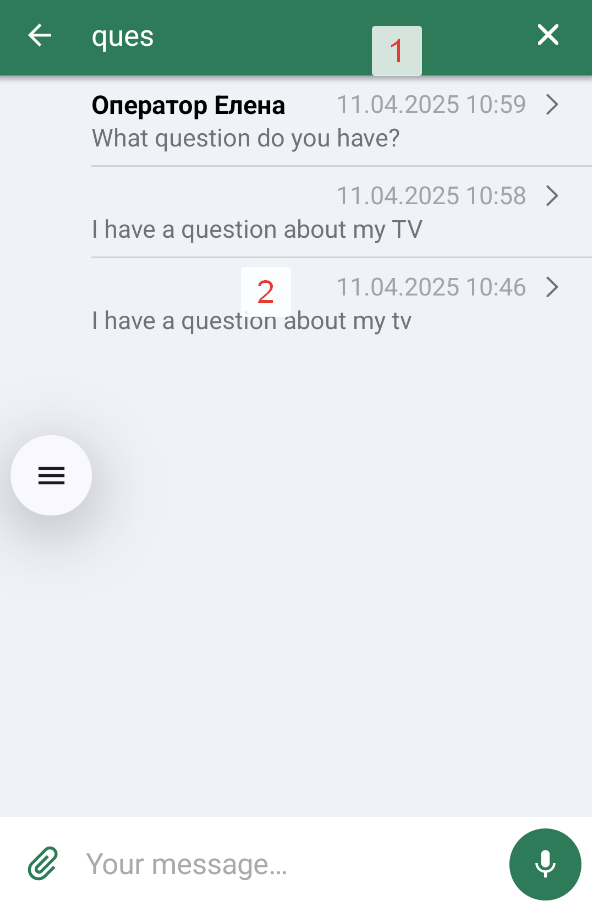
| № | Element | Path in themes | Style class |
|---|---|---|---|
| 1 | Input field clear button | searchFlow.clearInputBtn (see also SearchChatComponent.clearSearch) | ImagesChatStyle |
| 2.1 | Message author text color | searchFlow.searchBar.searchResultsStyle.searchResultsItemNameTextColor | SearchResultsStyle |
| 2.2 | Message text color | searchFlow.searchBar.searchResultsStyle.searchResultsItemMessageTextColor | SearchResultsStyle |
| 2.3 | Date text color | searchFlow.searchBar.searchResultsStyle.searchResultsItemDateTextColor | SearchResultsStyle |
| 2.4 | Divider color between results | searchFlow.searchBar.searchResultsStyle.searchResultsDividerColor | SearchResultsStyle |
| 2.5 | "Right arrow" icon | searchFlow.searchBar.searchResultsStyle.searchResultsItemRightArrowDrawable | SearchResultsStyle |
| 2.6 | "Right arrow" icon color | searchFlow.searchBar.searchResultsStyle.searchResultsItemRightArrowTintColor | SearchResultsStyle |
| 2.7 | Image when no results | searchFlow.searchBar.searchResultsStyle.searchResultsNoItemsImageDrawable | SearchResultsStyle |
| 2.8 | Text color when no results | searchFlow.searchBar.searchResultsStyle.searchResultsNoItemsTextColor | SearchResultsStyle |
| 2.9 | Search results background color | searchFlow.searchBar.searchResultsStyle.backgroundColor | SearchResultsStyle |
Popup message (Snackbar)
| Element | Path in themes | Style class |
|---|---|---|
| Popup message style | chatComponents.balloonComponent or direct assignment of BalloonsChatStyle | BalloonsChatStyle, BalloonComponent |
The style only works if the system can show a Snackbar attached to a view.
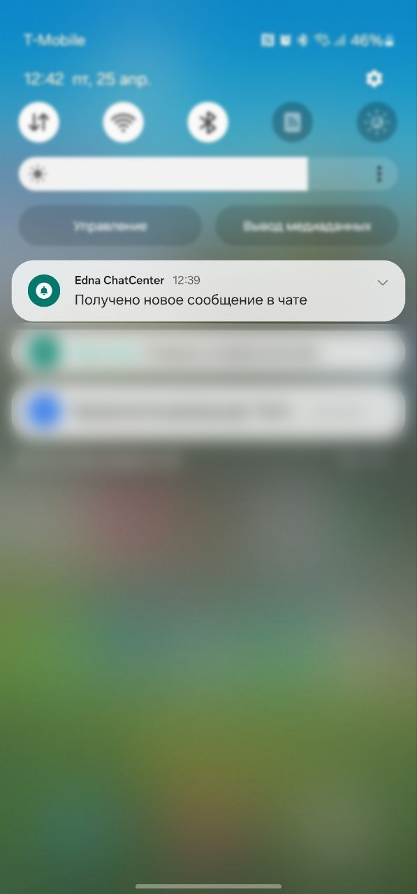
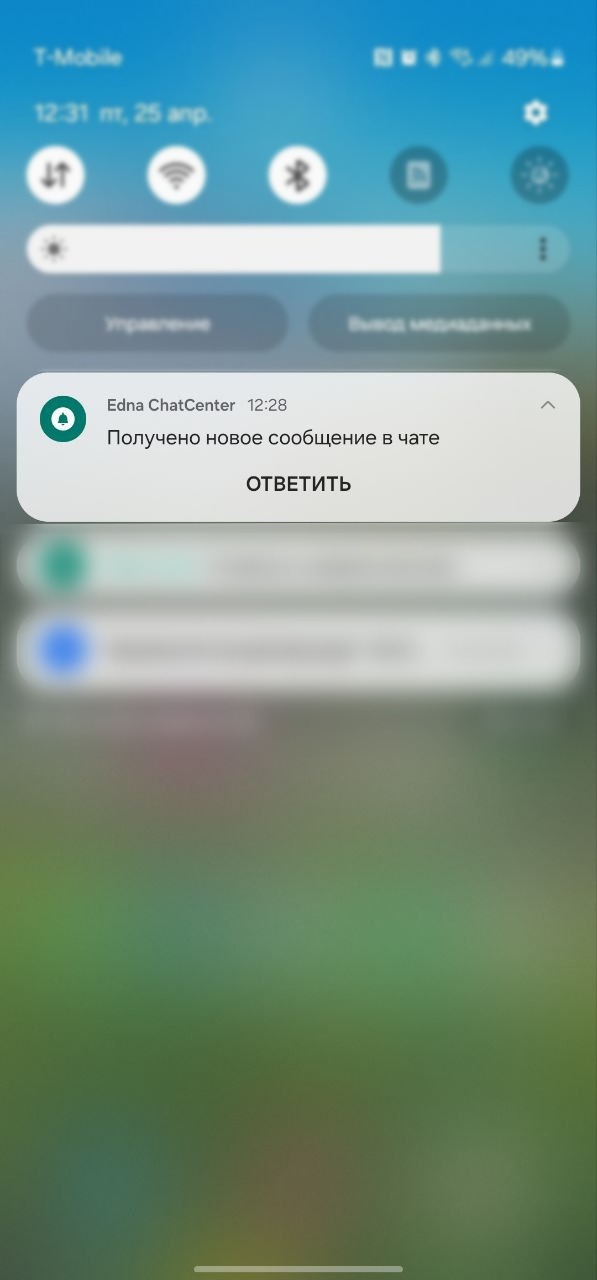
Push notifications
| Element | Path in themes | Style class |
|---|---|---|
| Compact push notification style | chatFlow.smallPushes | PushesChatStyle |
| Expanded push notification style | chatFlow.bigPushes | PushesChatStyle |
| Push background color | chatComponents.pushesComponent.pushBackgroundColor (@ColorRes) | PushesComponent |
| Push text color | chatComponents.pushesComponent.textColor (@ColorRes) | PushesComponent |
| Push icon | chatComponents.pushesComponent.icon (@DrawableRes) | PushesComponent |
| Default push title | chatComponents.pushesComponent.pushesDefaultTitle (@StringRes) | PushesComponent |
The input field and send button in the system notification are provided by Android (RemoteInput). The SDK does not provide public fields for separate styling of this screen: the background color, icon, and text are inherited from PushesComponent.
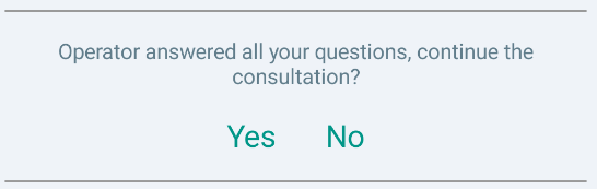
Dialog termination request
| № | Element | Path in themes | Style class |
|---|---|---|---|
| 1 | Request text | chatFlow.systemMessages.requestToResolve | SystemMessagesConfig, TextComponent |
| 2 | Positive response button | chatFlow.systemMessages.approveRequest | SystemMessagesConfig, TextComponent |
| 3 | Negative response button | chatFlow.systemMessages.denyRequest | SystemMessagesConfig, TextComponent |
Operator feedback (stars)
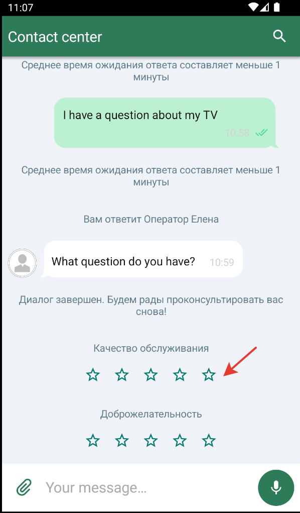
Texts and the star counter — via chatFlow.systemMessages.ratingStyle (RatingStyle). Star icons (empty / filled) — via chatFlow.surveyStyle.optionsSurvey* (SurveyStyle).
| № | Element | Path in themes | Style class |
|---|---|---|---|
| 1 | Rate invitation text | chatFlow.systemMessages.ratingStyle.askForRateText | RatingStyle, TextComponent |
| 2 | Thanks-for-rating text | chatFlow.systemMessages.ratingStyle.thanksForRateText | RatingStyle, TextComponent |
| 3 | Header above the rate invitation | chatFlow.systemMessages.ratingStyle.ratingHeaderText | RatingStyle, TextComponent |
| 4 | "N" text (selected stars count) | chatFlow.systemMessages.ratingStyle.rateStarsCount | RatingStyle, TextComponent |
| 5 | "of" text | chatFlow.systemMessages.ratingStyle.rateFrom | RatingStyle, TextComponent |
| 6 | "5" text (max stars) | chatFlow.systemMessages.ratingStyle.rateTotalStarsCount | RatingStyle, TextComponent |
| 7 | Star image style (background, size) | chatFlow.systemMessages.ratingStyle.rateStarImageStyle | RatingStyle, ImagesChatStyle |
| 8 | Empty star icon | chatFlow.surveyStyle.optionsSurveyUnselected | SurveyStyle, ImagesChatStyle |
| 9 | Filled star icon | chatFlow.surveyStyle.optionsSurveySelected | SurveyStyle, ImagesChatStyle |
Survey on dialog completion (thumbs)
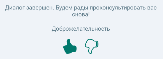
The binary "like / dislike" survey is styled via chatFlow.surveyStyle (the binarySurvey* fields). Invitation and thanks texts are shared with the star rating and are set via chatFlow.systemMessages.ratingStyle.
| № | Element | Path in themes | Style class |
|---|---|---|---|
| 1 | Like (thumbs up), unselected state | chatFlow.surveyStyle.binarySurveyLikeUnselected | SurveyStyle, ImagesChatStyle |
| 2 | Like (thumbs up), selected state | chatFlow.surveyStyle.binarySurveyLikeSelected | SurveyStyle, ImagesChatStyle |
| 3 | Dislike (thumbs down), unselected state | chatFlow.surveyStyle.binarySurveyDislikeUnselected | SurveyStyle, ImagesChatStyle |
| 4 | Dislike (thumbs down), selected state | chatFlow.surveyStyle.binarySurveyDislikeSelected | SurveyStyle, ImagesChatStyle |
| 5 | Icon color after the survey is completed | chatFlow.surveyStyle.surveyFinalColorFilterResId (@ColorRes) | SurveyStyle |
| 6 | Survey behavior type (MESSAGE / SYSTEM) | chatFlow.surveyStyle.type | SurveyMessageType |
| 7 | Invitation and thanks texts | chatFlow.systemMessages.ratingStyle.askForRateText / thanksForRateText | RatingStyle, TextComponent |
Button survey
| № | Element | Path in themes | Style class |
|---|---|---|---|
| 1 | Survey button style | chatFlow.buttonSurveyButton | TextMessageStyle, IconButtonChatStyle |
| 2 | Question text style | chatFlow.buttonSurveyQuestion | TextMessageStyle, TextComponent |
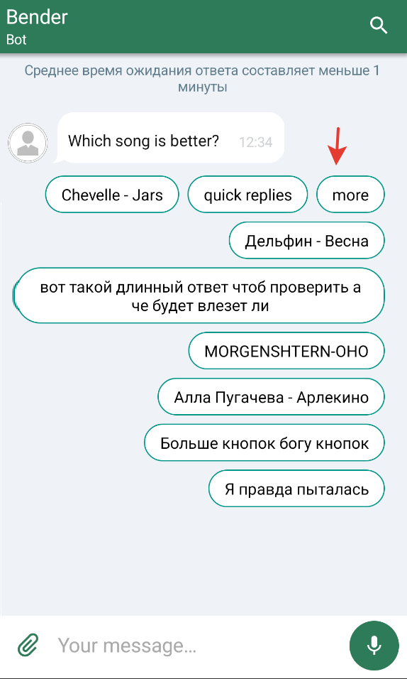
Quick replies in the chat (chip plates)
| Element | Path in themes | Style class |
|---|---|---|
| Quick reply button text style | chatFlow.chip | TextMessageStyle, TextComponent |
| Quick replies chip text color | chatColors.quickRepliesText | ChatColors |
| Chip background tint | chatColors.quickReplyButtonBackgroundTint | ChatColors |
| Chip background image | chatImages.quickReplyButtonBackground | ChatImages |
Outgoing file preview

| № | Element | Path in themes | Style class |
|---|---|---|---|
| 1 | Quote header | chatFlow.quoteView.quoteHeaderChatViewText | QuoteViewStyle, TextComponent |
| 2 | Quote text | chatFlow.quoteView.quoteMessageChatViewText | QuoteViewStyle, TextComponent |
| 3 | Quote "clear" button | chatFlow.quoteView.quoteClearIconButton | QuoteViewStyle, IconButtonChatStyle |
Voice file preview

| № | Element | Path in themes | Style class |
|---|---|---|---|
| 1 | Play/pause button | chatFlow.quotePlayPauseButton (and quotePlayPausePlayingStateButton for the active state) | ImagesChatStyle, IconButtonChatStyle |
| 2 | Voice message duration | chatFlow.quoteView.quoteDurationChatViewText | QuoteViewStyle, TextComponent |
Messages with a file
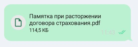
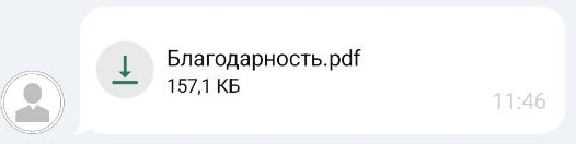
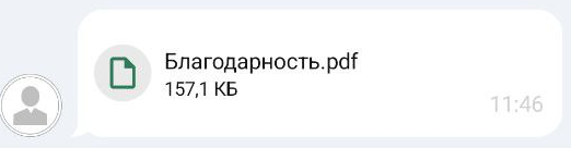
The file message style is configured via the FileMessageStyle type, available at chatFlow.incomeMessages.file / chatFlow.outcomeMessages.file.
| № | Element | Path in themes | Style class |
|---|---|---|---|
| 1 | File element background color | chatFlow.outcomeMessages.file.backgroundColor | FileMessageStyle, ImageComponent |
| 2 | Inner paddings | chatFlow.outcomeMessages.file.padding | FileMessageStyle |
| 3 | Loader style | chatFlow.outcomeMessages.file.loader | LoaderChatStyle |
| 4 | File name | chatFlow.outcomeMessages.file.fileName | TextComponent |
| 5 | File specs (size, type) | chatFlow.outcomeMessages.file.fileSpecs | TextComponent |
Message with a send error
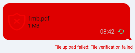
| № | Element | Path in themes | Style class |
|---|---|---|---|
| 1 | File upload error text | chatFlow.outcomeMessages.file.error (similarly for incomeMessages) | FileMessageStyle |
| 2 | Error bubble message style | chatFlow.errorMessages.chatBubble | BubblesChatStyle, BubbleComponent |
Image placeholder
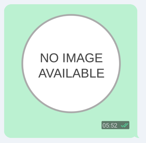
| Element | Path in themes | Style class |
|---|---|---|
| Placeholder resource for an unavailable image | imageFlow.imagePlaceholderResId (@DrawableRes) | ImageFlow, ImageComponent |
Progress bar on chat start
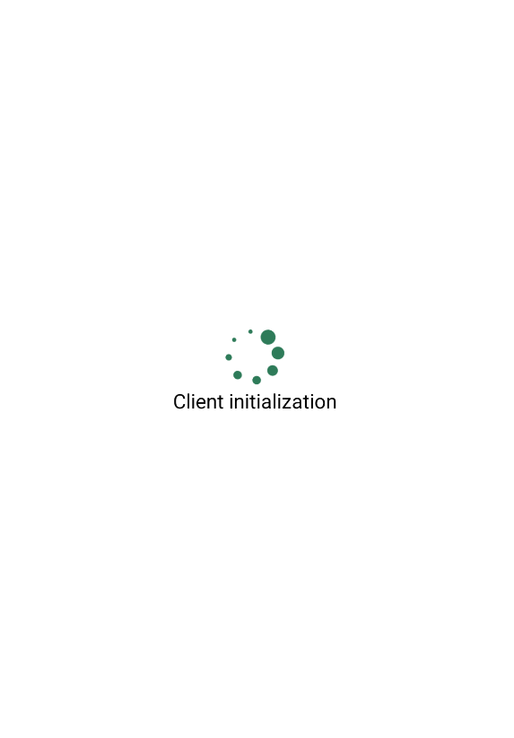
| Element | Path in themes | Style class |
|---|---|---|
| Progress bar on chat start | chatFlow.loader | LoaderChatStyle, LoadingIndicatorComponent |
Error screen
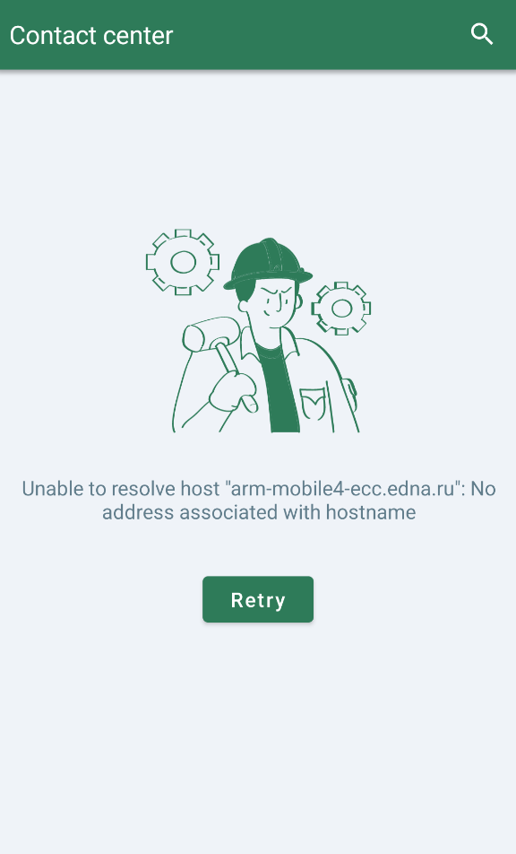
| № | Element | Path in themes | Style class |
|---|---|---|---|
| 1 | Chat re-initialization button | chatFlow.retryChatInitButton | TextButtonChatStyle, TextButtonComponent |
| 2 | Message on the error screen | chatFlow.errorScreenMessage | TextMessageStyle, TextComponent |
| 3 | Image on the error screen | chatFlow.errorScreenImage | ImagesChatStyle, ImageComponent |
Welcome screen
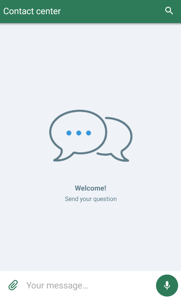
| № | Element | Path in themes | Style class |
|---|---|---|---|
| 1 | Welcome title | chatFlow.welcomeScreenStyle.welcomeScreenTitle | WelcomeScreenStyle, TextComponent |
| 2 | Welcome subtitle | chatFlow.welcomeScreenStyle.welcomeScreenSubtitle | WelcomeScreenStyle, TextComponent |
| 3 | Welcome image | chatFlow.welcomeScreenStyle.welcomeScreenImage | ImagesChatStyle |
| 4 | Welcome screen background color | chatFlow.welcomeScreenStyle.backgroundColor | WelcomeScreenStyle, ChatMainComponent |
Scroll-down button
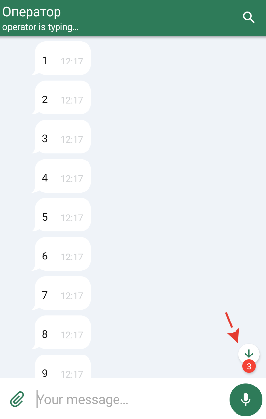
| № | Element | Path in themes | Style class |
|---|---|---|---|
| 1 | Scroll-down button style | chatFlow.scrollDownButton | ImagesChatStyle, ImageComponent |
| 2 | Unread sticker color | chatFlow.unreadMsgStickerColor (@ColorRes) | ChatFlow, ChatMainComponent |
| 3 | Text on the unread sticker | chatFlow.unreadMessagesCount | TextMessageStyle, TextComponent |
Scroll-up button
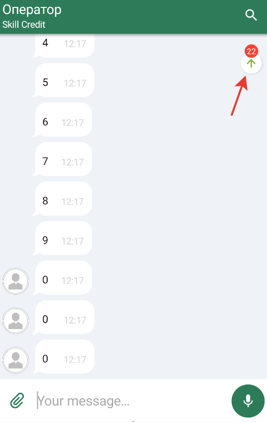
| № | Element | Path in themes | Style class |
|---|---|---|---|
| 1 | Scroll-up button style | chatFlow.scrollUpButton | ImagesChatStyle, ImageComponent |
| 2 | Unread sticker color (top) | chatFlow.unreadMsgStickerUpColor (@ColorRes) | ChatFlow, ChatMainComponent |
| 3 | Text on the top unread sticker | chatFlow.unreadMessagesCountUp | TextMessageStyle, TextComponent |
Theming priorities: ChatColors, ChatImages, Components, and Flows
The theme system is split into several levels:
-
ChatColors / ChatImages / ChatTexts / ChatTypography Base value tables. At this level, global colors, images, texts, and fonts for the entire SDK are defined.
-
ChatComponents Combines the base tables and assembles ready-made components from them (buttons, toolbar, message bubbles, loaders, etc.). Changes at this level are applied immediately to whole groups of elements.
-
ChatFlows The final layer where screen and scenario styles are assembled from components (
chatFlow,searchFlow, etc.). UseChatFlowsto override a specific element's behavior (for example, only the time of error messages).
Application priority:
- A value set in
ChatColors/ChatImagesbecomes the default value for all components. - A value set in
ChatComponentsis used in all flows until the flow overrides it on its own. - A value set directly in
ChatFlowshas the highest priority.
Recommended customization order (minimizes the number of overrides in ChatFlows):
- Set brand colors and icons via
ChatColorsandChatImages. - If needed — configure components (for example,
navigationBarStyleoraudioPlayer). - Only for special cases (errors, particular messages, etc.) — modify
ChatFlows.
Common customization scenarios
A few typical examples of appearance configuration.
Example 1. Your own brand colors for bubbles and toolbar
val lightColors = ChatColors(
    main = R.color.your_brand_main,
    incomingBubble = R.color.your_incoming_bubble,
    outgoingBubble = R.color.your_outgoing_bubble,
    toolbar = R.color.your_toolbar_bg,
    toolbarText = R.color.your_toolbar_text,
    incomingText = R.color.your_incoming_text,
    outgoingText = R.color.your_outgoing_text,
)
Bubbles, toolbar, and buttons that use these colors by default are colored with the given values.
Example 2. Replacing the logo and push notification icon
val lightImages = ChatImages(
    logoImage = R.drawable.ic_your_brand_logo,
    pushIcon = R.drawable.ic_your_push_icon,
)
Overrides the welcome screen logo and the push icon in the status bar.
Example 3. Theme configuration via ChatComponents
val lightComponents = ChatComponents(
    context = applicationContext,
    colors = lightColors,
    images = lightImages,
    text = ChatTexts(),         // ChatTexts(...) — for default localized strings
    typography = ChatTypography() // ChatTypography(...) — for fonts and sizes
).apply {
    navigationBarStyle = navigationBarStyle.copy(
        closeButtonEnabled = false
    )
}
Sets general component settings: for example, disables the chat close button in the toolbar. The text and typography parameters are optional; if not specified, ChatTexts() and ChatTypography() defaults are used.
Example 4. Per-element configuration via ChatFlows
val lightFlows = ChatFlows(lightComponents).apply {
    // Time caption color for error messages
    chatFlow.outcomeMessages.timeTextWhenError =
        chatFlow.outcomeMessages.timeText.copy(
            textColor = R.color.your_error_time_color
        )

    // "Play" icon in quotes
    chatFlow.quotePlayPauseButton = ImagesChatStyle(
        imageResId = R.drawable.ic_your_play_icon,
        tintColor = R.color.your_brand_main
    )
}

val chatLightTheme = ChatTheme(lightFlows)
First the components are configured, then individual elements are refined via flows if needed.
Example 5. Unified time color for error messages
A common case: substitute the color of time, time with an image, and Open Graph preview time of incoming and outgoing messages in the "send error" state.
val lightFlows = ChatFlows(lightComponents).apply {
    listOf(chatFlow.outcomeMessages, chatFlow.incomeMessages).forEach { messages ->
        messages.timeTextWhenError = messages.timeText.copy(
            textColor = R.color.your_error_time_color
        )
        messages.imagesTimeTextWhenError = messages.imagesTimeText.copy(
            textColor = R.color.your_error_time_color
        )
        messages.openGraphTimeTextWhenError = messages.openGraphTimeText.copy(
            textColor = R.color.your_error_time_color
        )
    }
}
Every *WhenError field is optional: if not set, the value from the base * field is used.
Enum value reference
Many theme components (BubbleComponent, IconButtonComponent, LoadingIndicatorComponent, etc.) are indexed by enum values. To get the style of the "Back" button, use iconButtonComponent[IconButtonEnum.BACK]. Below — value references.
BubbleStyleEnum
Package: edna.chatcenter.ui.visual.uiStyle.settings.components.bubble. Access via bubbleComponent[BubbleStyleEnum.X] and back via BubbleViewSelector.
| Value | Description |
|---|---|
INCOMING_BUBBLE | Incoming message bubble (from the operator). |
OUTGOING_BUBBLE | Outgoing message bubble (from the user). |
ERROR_BUBBLE | Bubble of a message whose send ended with an error. |
IconButtonEnum
Package: edna.chatcenter.ui.visual.uiStyle.settings.components.iconButton. Implements ChatComponentEnum.
A total of 14 values:
| Value | Button |
|---|---|
BACK | "Back" button in the toolbar. |
INVERTED_BACK | "Back" in the inverted (dark) toolbar theme. |
MENU | Menu button (three dots). |
ATTACH | Attachment attach. |
MICROPHONE | Voice message recording. |
SEND | Send button in the input field. |
COPY | Copy a message from the context menu. |
REPLY | Reply to a message. |
QUOTE_REPLY | Reply icon in the quote area. |
QUOTE_CLEAR | Delete the selected quote. |
SEARCH | Search icon in the toolbar. |
CLEAR_SEARCH | Clear the search field. |
PLAY_PAUSE_INCOMING | Play/pause for incoming voice messages. |
PLAY_PAUSE_OUTGOING | Play/pause for outgoing voice messages. |
LoadingIndicatorEnum
Package: edna.chatcenter.ui.visual.uiStyle.settings.components.loadingIndicator. Implements ChatComponentEnum.
| Value | Where it is displayed |
|---|---|
INCOMING_MESSAGE | Loader in an incoming message bubble (for example, while loading an attachment). |
OUTGOING_MESSAGE | Loader in an outgoing bubble. |
PAGE | Full-screen loader while loading history / opening the chat. |
SEARCH | Loader on the search screen. |
ImageStyleEnum (selection)
Package: edna.chatcenter.ui.visual.uiStyle.settings.components.image. Full list — see Dokka. Key values:
| Value | Use |
|---|---|
INCOMING_IMAGE / OUTGOING_IMAGE | Image styles in bubbles. |
CONSULT_MESSAGE_AVATAR | Operator avatar. |
LOGO_IMAGE | Logo in the navigation bar. |
ERROR_ICON / ERROR_SCREEN_IMAGE | Error icons (next to a message and on the full-screen error screen). |
INFO_ICON | Information icons in system messages. |
BINARY_SURVEY_LIKE_SELECTED_ICON / BINARY_SURVEY_LIKE_UNSELECTED_ICON | Like icons of the binary survey. |
BINARY_SURVEY_DISLIKE_SELECTED_ICON / BINARY_SURVEY_DISLIKE_UNSELECTED_ICON | Dislike icons. |
FILES_AND_MEDIA_IMAGE | Icons in the files / media list. |
TextStyleEnum (selection)
Package: edna.chatcenter.ui.visual.uiStyle.settings.components.textChat. This enum has many values (~30+) — below are the most frequently used during customization:
| Value | Where applied |
|---|---|
BALLOON | Text of balloon tooltips. |
CHIP | Chip plates (for example, date). |
ALERTS_TITLE / ALERTS_REGULAR | Titles and text of system alerts. |
BUTTONS_SURVEY_BUTTON_TEXT / BUTTONS_SURVEY_QUESTION_TEXT | Text in button surveys. |
APPROVE_REQUEST / DENY_REQUEST | "Accept" / "Decline" buttons in system requests. |
ASK_FOR_RATE | Chat rate invitation text. |
AUDIO_STATUS | Audio player state text. |
CHAT_ERROR_SCREEN_MESSAGE | Message on the error screen. |
DATE_MESSAGE | System message with a date. |
To get the full list of values, call TextStyleEnum.entries in code or see Dokka.
Alignment (structures)
Package: edna.chatcenter.ui.visual.uiStyle.settings.structures. Serializable.
| Value | Description |
|---|---|
LEFT | Left-aligned. |
CENTER | Center-aligned. |
RIGHT | Right-aligned. |
VerticalAlignment
Package: edna.chatcenter.ui.visual.uiStyle.settings.structures. Serializable. Companion: VerticalAlignment.Companion.getDefault().
| Value | Description |
|---|---|
TOP | Top-aligned. |
CENTER | Center-aligned vertically. |
BOTTOM | Bottom-aligned. |
ContentGravity
Package: edna.chatcenter.ui.visual.styles.permissions. Used in permission description dialog styles.
| Value | Description |
|---|---|
LEFT / CENTER / RIGHT | Horizontal alignment of content (title/description) inside the dialog. |
PermissionDescriptionType
Package: edna.chatcenter.ui.visual.styles.permissions. Passed to the onAllowClick(type, permissionId) callback of the fragment so that you know which permission group the user responded to.
| Value | Permission group |
|---|---|
CAMERA | Camera access. |
RECORD_AUDIO | Audio recording (voice messages). |
STORAGE | External storage read / write (attachments). |
CurrentUiTheme
Package: edna.chatcenter.ui.visual.uiStyle. Companion method CurrentUiTheme.fromInt(intValue: Int?) reconstructs the value from a numeric code (used during serialization).
| Value | Description |
|---|---|
SYSTEM | Use the system theme setting (UiModeManager). Default for new integrations. |
LIGHT | Light theme forced on. |
DARK | Dark theme forced on. |
If you are unsure of a constant name, open <EnumName>.entries in Android Studio. All enums support this syntax (Kotlin 1.9+), and autocomplete will produce the full list with current names.
Full API
This page lists the most frequently used ChatComponents and ChatFlows fields. The full list of public classes, properties, and enums is in Dokka documentation, generated from the SDK sources.
Related sections
- Design system: overview — customization levels and theme architecture.
- Themes — three
ChatThemeconstructors and ready-made light/dark theme examples. - Colors —
ChatColorstable (116 fields). - Images —
ChatImagestable (66 fields). - Typography —
ChatTypography: 6 sizes + 20 TTF substitution points. - Flows — screen-specific customization: chat / search / gallery / files / image / popups / balloons / bottomMenu.