Themes
Applying themes
In the ChatCenterUI class, before calling init(...), set styles by modifying the theme or darkTheme fields.
The parameters are optional. The SDK has default light-theme parameters if you do not define your own.
If the dark theme is not defined, the SDK always uses the light theme.
Example:
chatCenterUI = ChatCenterUI(applicationContext).apply {
    theme = chatLightTheme
    darkTheme = chatDarkTheme
    init(server.threadsGateProviderUid, server.appMarker, chatConfig)
}
A theme consists of two layers. The first — components (ChatComponents),
the second — flows (ChatFlows). Components are a set of common styles for individual views.
For example, below is a code fragment for "icon buttons" inside the SDK:
class IconButtonComponent(
    internal val context: Context,
    colors: ChatColors,
    images: ChatImages
) {
    /**
     * Icon for the "back" button
     */
    @DrawableRes
    var backBtnImage = images.backBtn

   //...

    /**
     * "Back" button color
     */
    @ColorRes
    var backButtonColor = colors.backButton

    /**
     * Inverted "back" button color
     */
    @ColorRes
    var chatToolbarInverseIconTintColor = colors.chatToolbarInverseIconTint

    //...

    /**
     * Quote clear icon color
     */
    @ColorRes
    var quoteClearIconColor = colors.quoteClearIcon

}
These fields apply to all similar buttons in the app. You can override entire components in the SDK or override a specific button per-point via ChatFlows.
A chat component can be overridden either entirely or in part:
val lightChatComponents = ChatComponents(
    applicationContext,
    colors = lightColors,
    images = lightImages
).apply {
    navigationBarStyle = navigationBarStyle.copy(closeButtonEnabled = false)
}
The colors and images passed in when creating the components above are optional. You can set your own, overriding only what you need:
val lightColors = ChatColors(
    main = R.color.light_main,
    searchingProgressLoader = R.color.light_main,
    bodyIconsTint = R.color.light_main,
    incomingText = R.color.black_color,
    incomingTimeText = R.color.light_time_text,
    outgoingTimeText = R.color.light_time_text,
    outgoingText = R.color.black_color,
    incomingBubble = R.color.alt_white,
    outgoingBubble = R.color.light_outgoing_bubble,
    toolbarText = R.color.white_color,
    messageSendingStatus = R.color.light_icons,
    messageSentStatus = R.color.light_icons,
    messageDeliveredStatus = R.color.light_icons,
    messageReadStatus = R.color.light_icons,
    messageFailedStatus = R.color.light_icons,
    incomingLink = R.color.light_links,
    outgoingLink = R.color.light_links,
    toolbar = R.color.light_main,
    statusBar = R.color.light_statusbar,
    menuItem = R.color.light_main
)
When overriding the component above for the light theme, we change the back button for all screens: chat, image viewing, etc.
However, if you override this button inside ChatFlows, it will have higher priority than the component.
Next, create the theme:
chatLightTheme = ChatTheme(lightChatComponents)
and set it during SDK initialization:
chatCenterUI = ChatCenterUI(applicationContext, loggerConfig).apply {
    theme = chatLightTheme
    darkTheme = chatDarkTheme
    init(server.threadsGateProviderUid ?: "", server.appMarker ?: "", chatConf)
}
ChatFlows exposes all elements displayed in the SDK. For example, if you need to override only the "back" button per-point, do it like this:
val flows = ChatFlows(ChatComponents(applicationContext)).apply {
    // change the "back" button
    chatFlow.navigationBar.backButton = IconButtonChatStyle(
        IconButtonColorStyle(
            iconTintColor = R.color.blue_color
        ),
        R.drawable.ic_cloud
    )
    // center toolbar text
    chatFlow.navigationBar.centerToolbarText = true
}
chatLightTheme = ChatTheme(flows) // create a theme instance with per-point overrides
When defining a flow, as in the case with backButton above, you must call copy() on the existing flow (data class) and override the value in the copy, or create a new flow. Direct field assignment may not have the desired effect.
So, when creating themes, you can both define components that set styles at a lower level and override specific views with ChatFlows.
Or, for example, to override the input field hint in search:
val flows = ChatFlows(ChatComponents(applicationContext)).apply {
    // ... other flow settings, if needed
    searchFlow.searchBar.textInput?.placeholderText = "Search messages"
}
Example of overriding text color in all input fields via a component:
ChatTheme(
    lightChatComponents.apply {
        inputTextComponent.inputMessageColor = R.color.alt_blue
    }
)
For more, see our demo and the dedicated section describing all public API methods.
Resources
Resource descriptions are in this section.
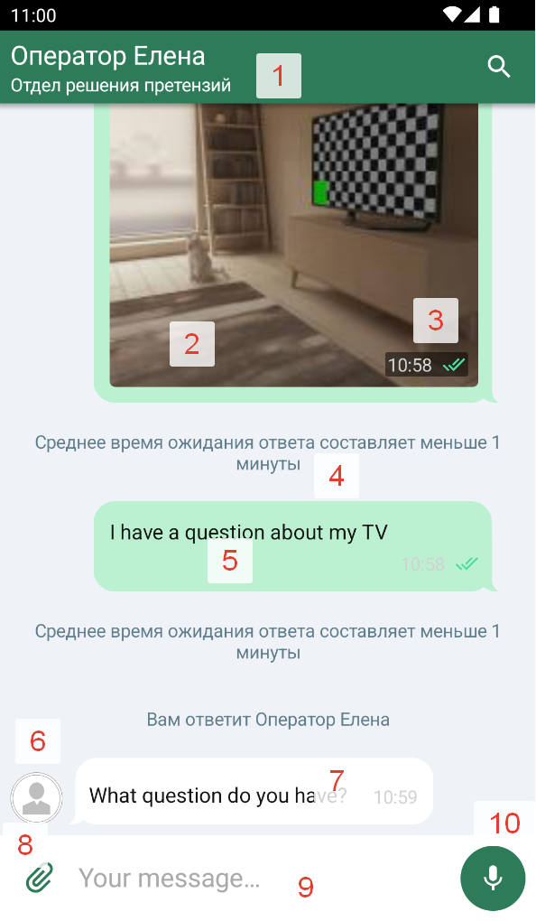
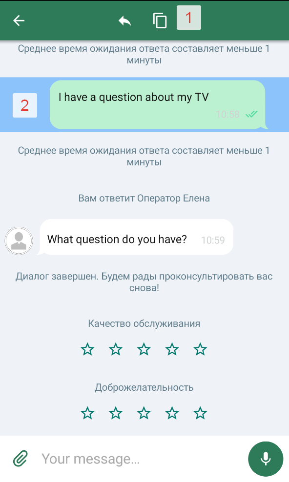
Infographic
This section describes chat elements and their customization via flows and components, with images.
Main chat elements
1.1. Toolbar title – chatFlow
→ navigationBar
→ toolbarHeaderText
Component: NavigationBarStyle
1.2. Toolbar subtitle – chatFlow
→ navigationBar
→ toolbarSubtitleText
Component: NavigationBarStyle
1.3. Formatted title (Spannable) – chatFlow → navigationBar → toolbarSpannableHeaderText Component: NavigationBarStyle
1.4. Search icon – searchFlow → searchBar → searchIcon Component: SearchChatComponent
1.5. Navigation bar background color – chatFlow → navigationBar → backgroundColor. Component: NavigationBarStyle.
1.6. Status bar color – chatFlow → navigationBar → statusBarColor. Component: NavigationBarStyle.
1.7. Toolbar shadow visibility – chatFlow → navigationBar → visibleShadow. Component: NavigationBarStyle.
1.8. Toolbar text centering – chatFlow → navigationBar → centerToolbarText. Component: NavigationBarStyle.
1.9. "Back" button enabled – chatFlow → navigationBar → closeButtonEnabled. Component: NavigationBarStyle.
1.10. Subtitle visibility in the toolbar – chatFlow → navigationBar → chatSubtitleEnabled. Component: NavigationBarStyle.
1.11. "Back" button style – chatFlow → navigationBar → backButton. Component: NavigationBarStyle.
1.12. Search button style – chatFlow → navigationBar → searchButton. Component: NavigationBarStyle.
2.1. Image in a message – chatFlow → image. Component: ImageComponent.
2.2. Chat bubble (general style) – chatFlow → chatBubble. Component: BubbleComponent.
2.3. Message status icons – chatFlow → statusIcons. Component: MessageStatusesComponent.
3. Time text in a message with an image – chatFlow → imagesTimeText. Component: TextComponent.
4. System messages style – systemMessages → systemMessageText. Components: TextComponent, ImageComponent.
5. Outgoing message style – outcomeMessages.
6. Operator avatar in the chat – imageFlow. Component: ImageComponent.
7. Incoming message style – incomeMessages. All components are involved.
8. Attach button – chatFlow → inputView → attachButton. Component: iconButtonComponent.
9. Message input field – chatFlow → inputView. Components: iconButtonComponent, inputTextComponent.
10.1. Message recording – chatFlow → inputView → voiceButton. Component: iconButtonComponent.
10.2. Message sending – chatFlow → inputView → sendButton. Component: iconButtonComponent.
Behavior on message selection
1. "Copy" button style – chatFlow → navigationBar → copyButton. Component: NavigationBarStyle.
2. "Reply with quote" button style – chatFlow → navigationBar → replyButton. Component: NavigationBarStyle.
3. Inverted "Back" button – chatFlow → navigationBar → invertedBackButton. Component: NavigationBarStyle.
4. Background color under a selected message – chatFlow → highlightingColor.
Message search field
1. Search button style – chatFlow → navigationBar → searchButton. Component: SearchChatComponent.
2. Loader color during search – searchFlow → searchLoaderColor. Component: SearchChatComponent.
3. Input field style – searchFlow → textInput. Component: SearchChatComponent.
Found messages list
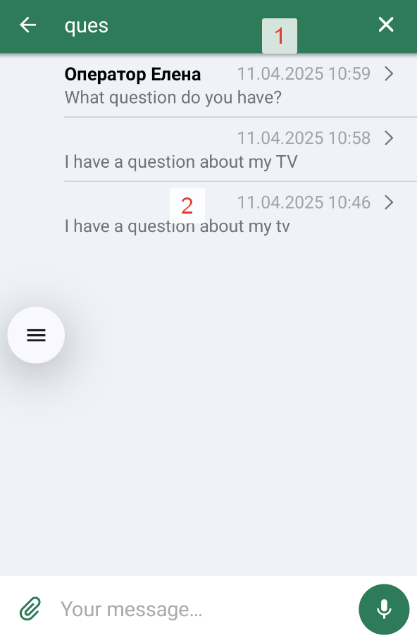
1. Input field clear button style – searchFlow → clearSearch. Component: SearchChatComponent.
2.1. Message author text color – searchFlow → searchResultsStyle → searchResultsItemNameTextColor. Component: SearchChatComponent.
2.2. Message text color – searchFlow → searchResultsStyle → searchResultsItemMessageTextColor. Component: SearchChatComponent.
2.3. Date text color – searchFlow → searchResultsStyle → searchResultsItemDateTextColor. Component: SearchChatComponent.
2.4. Divider color between results – searchFlow → searchResultsStyle → searchResultsDividerColor. Component: SearchChatComponent.
2.5. "Right arrow" icon – searchFlow → searchResultsStyle → searchResultsItemRightArrowDrawable. Component: SearchChatComponent.
2.6. "Right arrow" icon color – searchFlow → searchResultsStyle → searchResultsItemRightArrowTintColor. Component: SearchChatComponent.
2.7. No-results image – searchFlow → searchResultsStyle → searchResultsNoItemsImageDrawable. Component: SearchChatComponent.
2.8. No-results text – searchFlow → searchResultsStyle → searchResultsNoItemsText. Component: SearchChatComponent.
2.9. No-results text color – searchFlow → searchResultsStyle → searchResultsNoItemsTextColor. Component: SearchChatComponent.
2.10. Search results background color – searchFlow → searchResultsStyle → backgroundColor. Component: SearchChatComponent.
Popup message
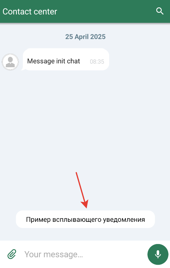
Popup message style – balloonsChatStyle. Styled only if the system can attach a Snackbar to a view.
Compact push
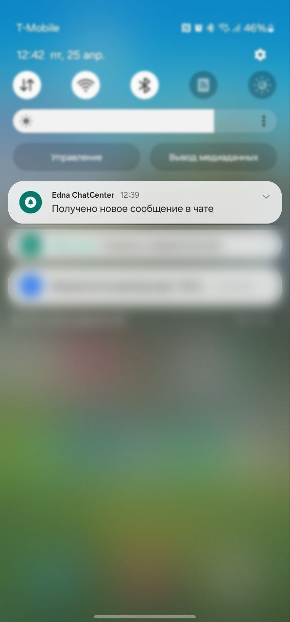
Compact push notification style – smallPushes. Component: PushesComponent.
Expanded push
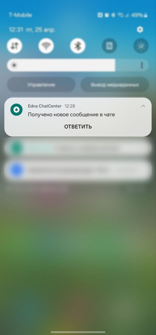
Expanded push notification style – bigPushes. Component: PushesComponent.
Quick reply from a push
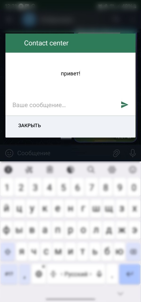
1. Toolbar style – chatFlow → navigationBarStyle. Component: NavigationBarStyle.
2. Background color – chatFlow → backgroundColor. Component: ImageComponent.
3. Background color behind the input field – chatFlow → answerLayoutBackgroundColor. Component: InputTextComponent.
4. Icon for replying with a quote – chatFlow → replyIcon. Component: IconButtonComponent.
5. Icon color – chatFlow → iconColor. Component: ImageComponent.
6. Send button style – chatFlow → sendButton. Component: IconButtonComponent.
7. Operator name text style – chatFlow → consultNameText. Component: TextComponent.
8. Question text style – chatFlow → questionText. Component: TextComponent.
9. Quick-reply input field style – chatFlow → fastTextInput. Component: InputTextComponent.
Dialog termination request
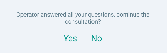
1. Text – chatFlow → systemMessages → approveRequest. Component: TextComponent.
2. Positive response button – chatFlow → systemMessages → denyRequest. Component: TextComponent.
3. Negative response button – chatFlow → systemMessages → requestToResolve. Component: TextComponent.
Operator feedback (stars)
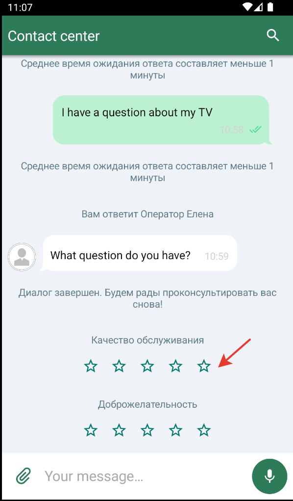
1. Rate invitation text – chatFlow → systemMessages → ratingStyle → askForRateText. Component: TextComponent.
2. Thanks-for-rating text – chatFlow → systemMessages → ratingStyle → thanksForRateText. Component: TextComponent.
3. Empty star icon – chatFlow → surveyStyle → optionsSurveyUnselected. Component: ImageComponent.
4. Filled star icon – chatFlow → surveyStyle → optionsSurveySelected. Component: ImageComponent.
Dialog completion survey (thumbs)
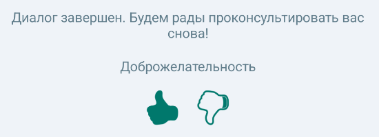
Rating style – chatFlow → systemMessages → ratingStyle. Component: RatingComponent.
Button survey
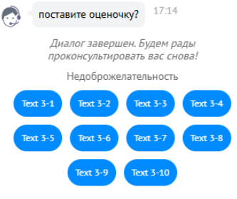
1. Survey button style – chatFlow → buttonSurveyButton. Component: IconButtonChatStyle.
2. Survey question text style – chatFlow → buttonSurveyQuestion. Component: TextComponent.
Quick replies in the chat
Quick reply button text style – chatFlow → chip. Component: TextComponent.
Outgoing file preview

1. Quote header text style – QuoteViewStyle → quoteHeaderChatViewText. Component: TextComponent.
2. Quote message text style – QuoteViewStyle → quoteMessageChatViewText. Component: TextComponent.
3. Quote "clear" button style – QuoteViewStyle → quoteClearIconButton. Component: IconButtonChatStyle.
Voice file preview

1. Play/pause button style – chatFlow → quotePlayPauseButton. Component: IconButtonChatStyle.
2. Voice message duration text style – chatFlow → quoteViewStyle → quoteDurationChatViewText. Component: TextComponent.
Messages with a file
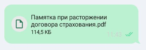


chatFlow → outcomeMessages / incomeMessages → see the field descriptions below:
1. File element background color – FileMessageStyle → backgroundColor. Component: ImageComponent.
2. Element inner paddings – padding. Component: ImageComponent.
3. Loader style – loader. Component: LoaderChatStyle.
4. File name style – fileName. Component: TextComponent.
5. File specs style – fileSpecs. Component: TextComponent.
Message with a send error
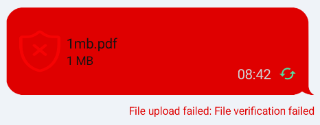
1. File upload error text – chatFlow → outcomeMessages / incomeMessages → fileMessageStyle → error.
2. Error messages style – chatFlow → errorMessages → chatBubble. Component: BubbleComponent.
Image placeholder
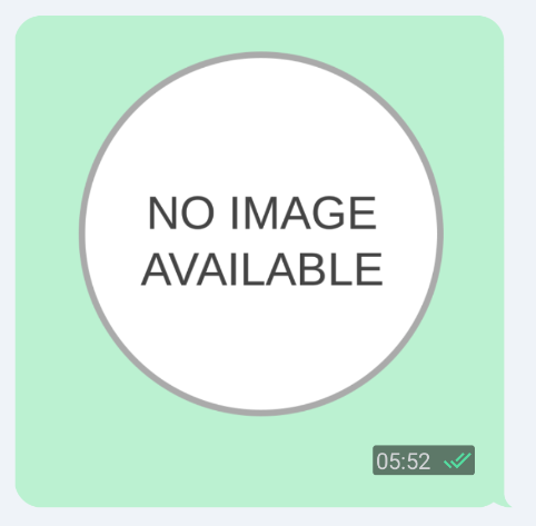
Placeholder resource for an unavailable image – imageFlow → imagePlaceholderResId. Component: ImageComponent.
Progress bar on chat start
Progress bar on chat start – chatFlow → loader. Component: LoadingIndicatorComponent.
Error screen
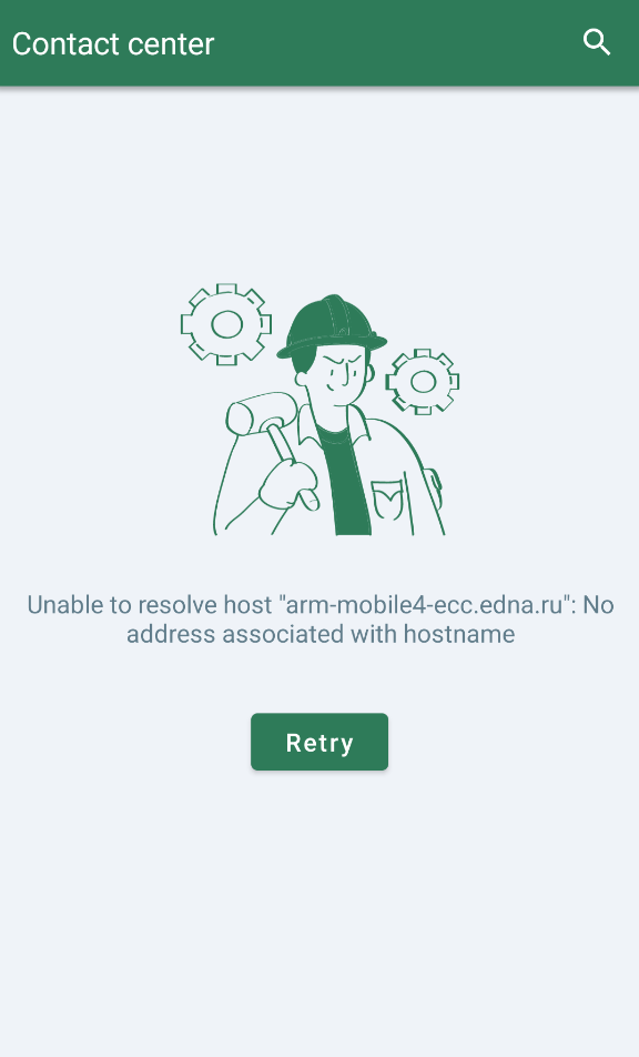
1. Chat re-initialization button – chatFlow → retryChatInitButton. Component: TextButtonComponent.
2. Chat error screen message – chatFlow → errorScreenMessage. Component: TextComponent.
3. Chat error screen image – chatFlow → errorScreenImage. Component: ImageComponent.
Welcome screen
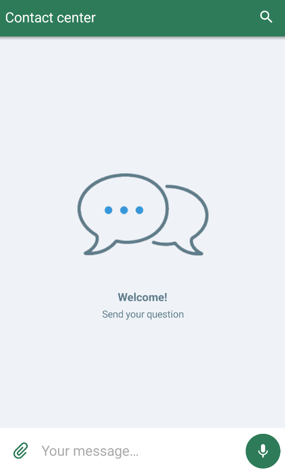
1. Welcome title style – chatFlow → welcomeScreenStyle → welcomeScreenTitle. Component: TextComponent.
2. Welcome subtitle style – chatFlow → welcomeScreenStyle → welcomeScreenSubtitle. Component: TextComponent.
3. Welcome image style – chatFlow → welcomeScreenStyle → welcomeScreenImage. Component: ImagesChatStyle.
4. Welcome screen background color – chatFlow → welcomeScreenStyle → backgroundColor. Component: ChatMainComponent.
Scroll-down button
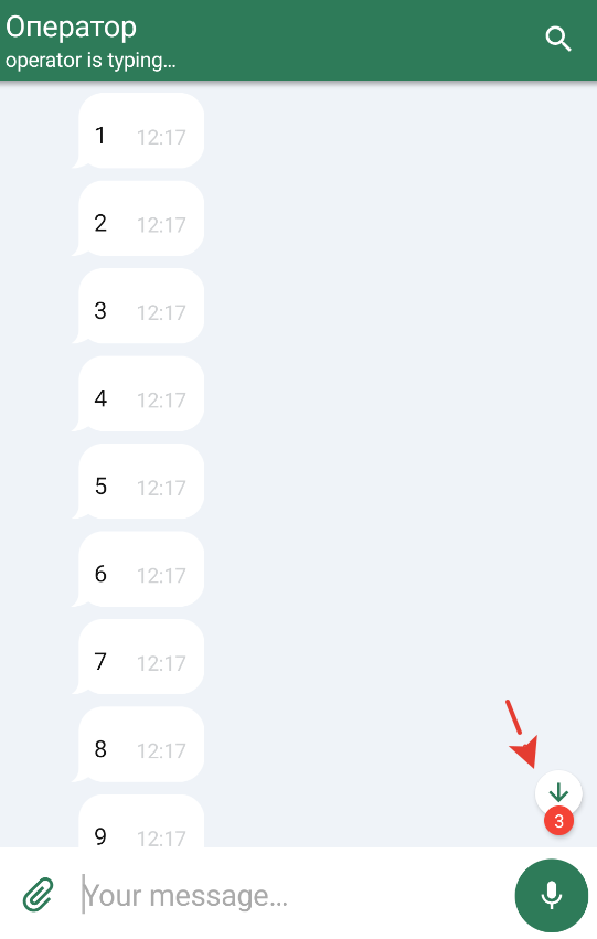
1. Scroll button style – chatFlow → outcomeMessages / incomeMessages → scrollDownButton. Component: ImageComponent.
2. Unread sticker color – chatFlow → outcomeMessages / incomeMessages → unreadMsgStickerColor. Component: ChatMainComponent.
3. Text on the unread sticker – chatFlow → outcomeMessages / incomeMessages → unreadMessagesCount. Component: TextComponent.
Scroll-up button
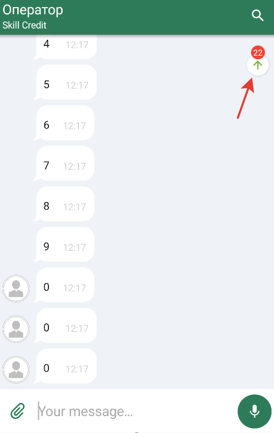
1. Scroll button style – chatFlow → outcomeMessages / incomeMessages → scrollUpButton. Component: ImageComponent.
2. Top unread sticker color – chatFlow → outcomeMessages / incomeMessages → unreadMsgStickerUpColor. Component: ChatMainComponent.
3. Text on the top unread sticker – chatFlow → outcomeMessages / incomeMessages → unreadMessagesCountUp. Component: TextComponent.
ChatColors parameter reference
Below are all available ChatColors fields. Values are set as references to color resources (R.color.*).
The full categorized reference is in Design system → Colors.
| Field | Description | Default value |
|---|---|---|
backButton | "Back" button color | R.color.ecc_white |
main | Primary chat color. Used in toolbar elements, loaders, etc. where no own color is set | R.color.ecc_green_83b144 |
searchingProgressLoader | Loader color while searching for an operator | R.color.ecc_consult_searching_progress_color |
bodyIconsTint | Icon color when no own color is set | main |
toolbar | Toolbar color | R.color.ecc_chat_toolbar |
toolbarContextMenu | "Three dots" icon color that opens the toolbar menu | R.color.ecc_chat_toolbar_context_menu |
statusBar | Status bar color | R.color.ecc_chat_status_bar |
menuItem | Menu item text color | R.color.ecc_chat_toolbar_menu_item |
toolbarText | Toolbar text color | R.color.ecc_white |
incomingText | Incoming message text color | R.color.ecc_black |
outgoingText | Outgoing message text color | R.color.ecc_white |
incomingLink | Incoming link text color | R.color.ecc_incoming_message_link |
outgoingLink | Outgoing link text color | R.color.ecc_outgoing_message_link |
disabledColor | Disabled elements color | R.color.ecc_disabled_text_color |
incomingBubble | Incoming bubble color | R.color.ecc_white |
outgoingBubble | Outgoing bubble color | main |
chatToolbarInverseIconTint | Toolbar icon color when the toolbar is inverted (e.g., on message selection) | R.color.ecc_white |
systemMessage | System message color | R.color.ecc_chat_system_message |
errorText | Error text color | R.color.ecc_error_red_df0000 |
mainTextWhenErrorBubble | Main text color when error bubble | R.color.ecc_white |
errorBackground | Bubble color on a message error (e.g., send failure) | R.color.ecc_error_red_df0000 |
errorIcon | Error icon color | R.color.ecc_white |
gallerySearchTitle | Search title text color on the gallery screen | R.color.ecc_white |
gallerySearchSubtitle | Search subtitle text color on the gallery screen | R.color.ecc_gallery_search_subtitle |
galleryImageBottomName | File name color under an image | R.color.ecc_white |
mediaAndFilesText | Text color in the "Files and media" section for title, file size, and time | R.color.ecc_black |
quickRepliesText | Quick replies text color | R.color.ecc_black |
quickReplyButtonBackgroundTint | Quick reply button background tint | R.color.ecc_white |
incomingTimeText | Time text color in incoming messages | incomingText |
outgoingTimeText | Time text color in outgoing messages | outgoingText |
incomingImageTimeBackground | Time underlay color in incoming messages | R.color.ecc_incoming_time_background |
outgoingImageTimeBackground | Time underlay color in outgoing messages | R.color.ecc_outgoing_time_background |
surveyText | Survey text color | R.color.ecc_chat_system_message |
buttonSurveyTextButtonColor | Button text color in a button survey | R.color.ecc_white |
surveyButtonBackgroundTintColor | Survey button background tint color | main |
buttonSurveyQuestionTextColor | Button survey question text color | R.color.ecc_chat_system_message |
surveyChoicesText | Survey choice text color | R.color.ecc_survey_choices_text |
rateStarsCount | Selected-stars count text color | R.color.ecc_chat_outgoing_message_bubble |
rateTotalStarsCount | Available-stars count text color | outgoingText |
rateFrom | "of" preposition text color (3 of 5) | outgoingText |
rateStar | Star icon color | outgoingText |
scheduleText | Schedule text color | R.color.ecc_schedule_text |
unreadMessagesCountText | Unread message count text color | R.color.ecc_chat_unread_msg_count_text |
quoteHeaderChatView | Quote header text color | R.color.ecc_black |
quoteText | Quote text color | R.color.ecc_black |
quoteClearIcon | Quote clear icon color | main |
welcomeScreenTitleText | Welcome screen title text color | R.color.ecc_welcome_screen_title |
welcomeScreenSubtitleText | Welcome screen subtitle text color | R.color.ecc_welcome_screen_subtitle |
inputMessage | Text color for input fields, except search | R.color.ecc_black |
inputMessageHint | Hint text color in input fields, except search | R.color.ecc_grey_aaa |
inputFieldBackground | Input field background color | R.color.ecc_white |
searchText | Search input field text color | R.color.ecc_white |
searchHint | Search field hint text color | R.color.ecc_cian_b2dfdb |
chatBackground | Chat window background color | R.color.ecc_chat_background |
searchResultBackground | Search results background color | R.color.ecc_chat_background |
filesAndMediaIconTint | Icon color in the "Files and media" section | R.color.ecc_green_83b144 |
voiceBtnBackground | Voice recording button background color | main |
voiceBtnIconColor | Voice recording button color | R.color.ecc_white |
sendBtnIconColor | Send button icon color | main |
messageSendingStatus | "Sending" status icon color | R.color.ecc_white |
messageSentStatus | "Sent" status icon color | R.color.ecc_white |
messageDeliveredStatus | "Delivered" status icon color | R.color.ecc_white |
messageReadStatus | "Read" status icon color | R.color.ecc_white |
messageFailedStatus | "Error" status icon color | R.color.ecc_white |
messageHighlighting | Bubble color when highlighted | R.color.ecc_chat_highlighting |
chatButtonTintColorStateList | Set of colors for different button states | arrayOf(disabledColor, main, main) |
chatErrorScreenButtonText | Button text color on the chat error screen | R.color.ecc_white |
chatErrorScreenMessageText | Message text color on the chat error screen | R.color.ecc_chat_new_system_message |
chatErrorScreenImageTint | Image tint color on the chat error screen | main |
pushBackground | Push notification background color | R.color.ecc_push_background |
pushMessage | Push notification text color | inputMessage |
quotePlayPauseButton | Play/pause button text color in a quoted message | R.color.ecc_preview_play_pause_button |
imageScreenBackground | Background color of the full-screen image viewer | R.color.ecc_attachments_background |
emptyStateBackground | Background color when there are no chat messages | R.color.ecc_empty_state_background |
separators | Chat separator color | R.color.ecc_icon_and_separators_color |
unreadMsgSticker | Sticker color (background behind unread digits) | R.color.ecc_chat_unread_msg_sticker_background |
microphone | Microphone icon color | R.color.ecc_record_button_small_mic |
balloonText | Text color of popup messages (Toast or Snackbar) | R.color.ecc_black |
balloonBackground | Background color of popup messages (Toast or Snackbar) | R.color.ecc_white |
progressButtonStartDownloadTint | "Download file" button color in the initial state (download not started) | bodyIconsTint |
progressButtonInProgressTint | "Download file" button color during download | bodyIconsTint |
progressButtonCompletedTint | "Download file" button color after download | bodyIconsTint |
progressButtonBackgroundTint | "Download file" button background color | R.color.ecc_progress_button_background |
surveySelectedColorFilter | Survey icon color when selected | R.color.ecc_survey_selected_icon_tint |
surveyUnselectedColorFilter | Survey icon color when not selected | R.color.ecc_survey_unselected_icon_tint |
bottomButtonTextColor | Bottom chat button text color (camera, gallery, file) | R.color.ecc_chat_toolbar |
bottomButtonsBackground | Bottom chat button background color (camera, gallery, file) | R.color.ecc_white |
imagesScreenText | Text color on the full-screen image viewer | R.color.ecc_white |
emptyFilesAndMediaText | Text color when "Files and media" is empty | R.color.ecc_black |
audioStatus | Text color of the current audio status (e.g., "processing") | R.color.ecc_black |
alertsText | Text color on popup screens (alerts) | R.color.ecc_black |
loaderTextColor | Loader message text color | R.color.ecc_black |
buttonsDefaultText | Default button text color | R.color.ecc_black |
buttonsDefaultStroke | Default button border color | R.color.ecc_black |
searchIcon | Search icon color | R.color.ecc_white |
searchLoaderTint | Search icon color for the loader while loading search results | R.color.ecc_white |
searchResultsDivider | Divider color between search result items | R.color.ecc_search_divider_color |
searchResultsItemRightArrowTint | "Right arrow" icon color in search results | R.color.ecc_search_results_item_secondary |
searchResultsItemDateText | Date text color in search results | R.color.ecc_search_results_item_secondary |
searchResultsItemMessageText | Text color of the message | R.color.ecc_search_results_message_color |
searchResultsItemNameText | Text color of the message author | R.color.ecc_black |
searchResultNoItemsText | "No results" text color | R.color.ecc_black |
searchBarText | Text color while entering a query | R.color.ecc_white |
chatToolbarHintText | Hint text color in the search input field | R.color.ecc_chat_toolbar_hint |
messageEditedStatus | "Message edited" status color | R.color.ecc_message_edited_color |
quoteBgColor | Quote background color | R.color.ecc_quote_bg_color |
quoteDelimiterColor | Quote delimiter color | R.color.ecc_quote_delimiter_color |
quoteAuthorColorText | Quote author text color | R.color.ecc_quote_author_color_text |
quoteColorText | Quote text color | R.color.ecc_quote_color_text |
quoteIconTintColor | Quote icon tint color | R.color.ecc_white |
infoIcon | Information icon color | R.color.ecc_error_red_df0000 |
searchHighlight | Search highlight color | main |
popupsBackground | Popup background color | R.color.ecc_cian_b2dfdb |
ChatImages parameter reference
Below are all available ChatImages fields. Values are set as references to image resources (R.drawable.*).
The full categorized reference is in Design system → Images.
| Field | Description | Default value |
|---|---|---|
backBtn | "Back" button icon in the toolbar | R.drawable.ecc_ic_arrow_back_white_24dp |
selectRing | Ring icon shown in the upper-right corner on file selection (unselected state) | R.drawable.ecc_aqua_ring |
loader | Main center-screen loader image | R.drawable.ecc_im_loading |
attachIcon | File attach icon | R.drawable.ecc_ic_attachment_button |
voiceBtnBackground | Voice recording button background image | R.drawable.ecc_record_button_background |
voiceBtnIcon | Voice recording button microphone icon | R.drawable.ecc_record_button_icon |
sendBtn | Voice message send button icon | R.drawable.ecc_ic_send_button |
quoteClearBtn | Cancel-quote button icon | R.drawable.ecc_ic_clear_36dp |
clearSearch | Search input clear button icon | R.drawable.ecc_ic_clear_gray_30dp |
menuIcon | Toolbar menu button icon | R.drawable.ecc_ic_more_vert_24dp |
downloadIcon | File download button icon | R.drawable.ecc_ic_file_download_white_24dp |
searchIcon | Search icon | R.drawable.ecc_ic_search_white_24dp |
playIcon | Voice file play icon | R.drawable.ecc_voice_message_play |
pauseIcon | Voice file pause icon | R.drawable.ecc_voice_message_pause |
copyIcon | File copy icon (toolbar button) | R.drawable.ecc_ic_content_copy_24dp |
replyIcon | File quote icon (toolbar button) | R.drawable.ecc_ic_reply_24dp |
quickReplyButtonBackground | Quick reply button background image | R.drawable.ecc_quick_reply_button_background |
surveyButtonBackground | Survey button background | R.drawable.ecc_survey_button_backround |
timestampOutgoingBackground | Timestamp background in an outgoing message | R.drawable.ecc_timestamp_outgoing_underlayer |
timestampIncomingBackground | Timestamp background in an incoming message | R.drawable.ecc_timestamp_incoming_background |
chatInputBackground | Message input field background image | R.drawable.ecc_chat_input_background |
logoImage | Logo on the welcome screen | R.drawable.ecc_welcome_logo |
operatorAvatarPlaceholder | Operator image placeholder | R.drawable.ecc_operator_avatar_placeholder |
imagePlaceholder | Image placeholder in a message | R.drawable.ecc_image_placeholder |
outgoingImageMask | Outgoing image mask (defines its shape) | R.drawable.alt_ecc_outgoing_image_mask |
incomingImageMask | Incoming image mask (defines its shape) | R.drawable.alt_ecc_incoming_image_mask |
outgoingBubbleImage | Outgoing message mask (defines its shape) | R.drawable.alt_ecc_outgoing_bubble |
incomingBubbleImage | Incoming message mask (defines its shape) | R.drawable.alt_ecc_incoming_bubble |
scrollDownButtonIcon | Scroll-to-latest button icon | R.drawable.ecc_scroll_down_icon |
scrollDownBackground | Scroll-to-latest button background | R.drawable.ecc_scroll_down_background |
scrollUpButtonIcon | Scroll-up button icon | R.drawable.ecc_scroll_up_icon |
scrollUpBackground | Scroll-up button background | R.drawable.ecc_scroll_down_background |
messageSending | "Sending" status icon | R.drawable.ecc_message_image_sending |
messageSent | "Sent" status icon | R.drawable.ecc_message_image_sending |
messageDelivered | "Delivered" status icon | R.drawable.ecc_message_image_delivered |
messageRead | "Read" status icon | R.drawable.ecc_image_message_read |
messageFailed | "Error" status icon | R.drawable.ecc_message_image_failed |
rateStarSelected | Filled star icon (survey) | R.drawable.ecc_options_survey_selected |
rateStarUnselected | Empty star icon (survey) | R.drawable.ecc_options_survey_unselected |
errorScreenImage | Image shown in the center of the screen on chat load error | R.drawable.ecc_serious_worker |
pushIcon | Push notification icon | R.drawable.ecc_default_push_icon |
balloonBackground | Popup notification background (Toast and Snackbar) | R.drawable.ecc_background_snackbar |
progressButtonStartDownload | Download start icon | R.drawable.ecc_ic_vertical_align_bottom_18dp |
progressButtonInProgress | Cancel download icon | R.drawable.ecc_ic_clear_36dp |
progressButtonCompleted | Download completed icon | R.drawable.ecc_ic_file_outline_24dp |
scheduleMessageIcon | Icon for messages with an unavailable operator due to schedule | R.drawable.ecc_schedule_icon |
binarySurveyLikeUnselectedIcon | Unfilled thumbs up icon (survey) | R.drawable.ecc_binary_survey_like_unselected |
binarySurveyLikeSelectedIcon | Filled thumbs up icon (survey) | R.drawable.ecc_binary_survey_like_selected |
binarySurveyDislikeUnselectedIcon | Unfilled thumbs down icon (survey) | R.drawable.ecc_binary_survey_dislike_unselected |
binarySurveyDislikeSelectedIcon | Filled thumbs down icon (survey) | R.drawable.ecc_binary_survey_dislike_selected |
attachmentCameraIcon | Camera icon in the bottom chat menu | R.drawable.ecc_ic_camera_42dp |
attachmentGalleryIcon | Gallery icon in the bottom chat menu | R.drawable.ecc_ic_photo_42dp |
attachmentFileIcon | File-picker icon in the bottom chat menu | R.drawable.ecc_ic_file_fill_42dp |
attachmentSendIcon | Send icon for messages with an attachment | R.drawable.ecc_ic_send_42dp |
attachmentQuoteIcon | Attachment quote icon | R.drawable.ecc_ic_reply_gray_24dp |
searchLoader | Search icon for the loader while loading search results. Defaults to the standard loader | loader |
searchResultsItemRightArrow | "Right arrow" icon in search results | R.drawable.right_arrow |
searchResultNoItemsImage | "No results" image | R.drawable.ecc_search_not_found |
messageEditedStatusIcon | Icon for a message with the "edited" status | R.drawable.ecc_message_image_edited |
quoteBackgroundImage | Quote background image | R.drawable.ecc_quote_background |
quoteIconBackground | File/microphone icon underlay image | R.drawable.ecc_circle_gray_48dp |
quoteFileIcon | File icon in attachment quotes | R.drawable.ecc_ic_file_outline_24dp |
quoteMicIcon | Microphone icon in voice-message quotes | R.drawable.ecc_ic_mic_24dp |
quoteImageMask | Image mask in quotes with a picture | R.drawable.ecc_quote_image_mask |
infoIcon | Information icon | R.drawable.ecc_info_icon |
Theming priorities: ChatColors, ChatImages, Components, and Flows
The theme system is split into several levels:
-
ChatColors / ChatImages / ChatTexts / ChatTypography
Base value tables. Here you set global colors, images, and fonts for the entire SDK. -
ChatComponents
Combines the base tables and assembles ready-made components from them (buttons, toolbar, message bubbles, loaders, etc.).
Changes at this level affect whole groups of elements immediately. -
ChatFlows
The final layer where screen and scenario styles are assembled from components (chatFlow,searchFlow, etc.).
Convenient for per-element overrides of specific behavior (e.g., only the time of error messages).
The priority rule is simple:
- If you change a value in
ChatColors/ChatImages, it becomes the new default value for all components. - If you override a field in
ChatComponents, it is used in all flows until the flow overrides it itself. - If you change styles directly in
ChatFlows(as in the demo app), those have the highest priority.
Recommended customization order:
- First set brand colors and icons via
ChatColorsandChatImages. - If needed — configure components (e.g.,
navigationBarStyleoraudioPlayer). - Only for special cases (errors, particular messages, etc.) — modify
ChatFlows.
Common customization scenarios
A few typical examples of appearance configuration based on the demo app.
Example 1. Your own brand colors for bubbles and toolbar
val lightColors = ChatColors(
    main = R.color.my_brand_main,
    incomingBubble = R.color.my_incoming_bubble,
    outgoingBubble = R.color.my_outgoing_bubble,
    toolbar = R.color.my_toolbar_bg,
    toolbarText = R.color.my_toolbar_text,
    incomingText = R.color.my_incoming_text,
    outgoingText = R.color.my_outgoing_text,
)
Now all elements that use these colors by default (bubbles, toolbar, buttons) will be tinted with your brand colors.
Example 2. Replacing the logo and push notification icon
val lightImages = ChatImages(
    logoImage = R.drawable.ic_my_brand_logo,
    pushIcon = R.drawable.ic_my_push_icon,
)
This changes the welcome screen logo and the push icon in the status bar.
Example 3. Theme configuration via ChatComponents
val lightComponents = ChatComponents(
    context = applicationContext,
    colors = lightColors,
    images = lightImages
).apply {
    navigationBarStyle = navigationBarStyle.copy(
        closeButtonEnabled = false
    )
}
Here you set general component settings (for example, disable the chat close button in the toolbar).
Example 4. Per-element configuration via ChatFlows
val lightFlows = ChatFlows(lightComponents).apply {
    // Change the time text color for error messages
    chatFlow.outcomeMessages.timeTextWhenError =
        chatFlow.outcomeMessages.timeText.copy(
            textColor = R.color.my_error_time_color
        )

    // Change the "play" icon in quotes
    chatFlow.quotePlayPauseButton = ImagesChatStyle(
        imageResId = R.drawable.ic_my_play_icon,
        tintColor = R.color.my_brand_main
    )
}

val chatLightTheme = ChatTheme(lightFlows)
This approach mirrors the logic in EdnaChatCenterApplication.initThemes() of the demo app:
first configure components, then refine individual elements via flows as needed.